


 on Traditional Banking")


In data visualisation, different tools and techniques are available to analysts to use data in a significant and insightful way. The waterfall chart is one such tool of Microsoft Excel; it suggests the cumulative impact of sequentially introduced positive or negative values. Although Waterfall Chart in Excel have various applications, it is essential to understand how they differ from other visualisation techniques so you can choose the right one for your data needs.
This blog will discuss waterfall charts, compare them to other visualisation techniques, and emphasise their advantages and disadvantages.
Table Of Contents
- What are Waterfall Charts?
- Key Features of Waterfall Charts
- Comparing Waterfall Charts to Other Visualisation Tools
- Conclusion
What are Waterfall Charts?
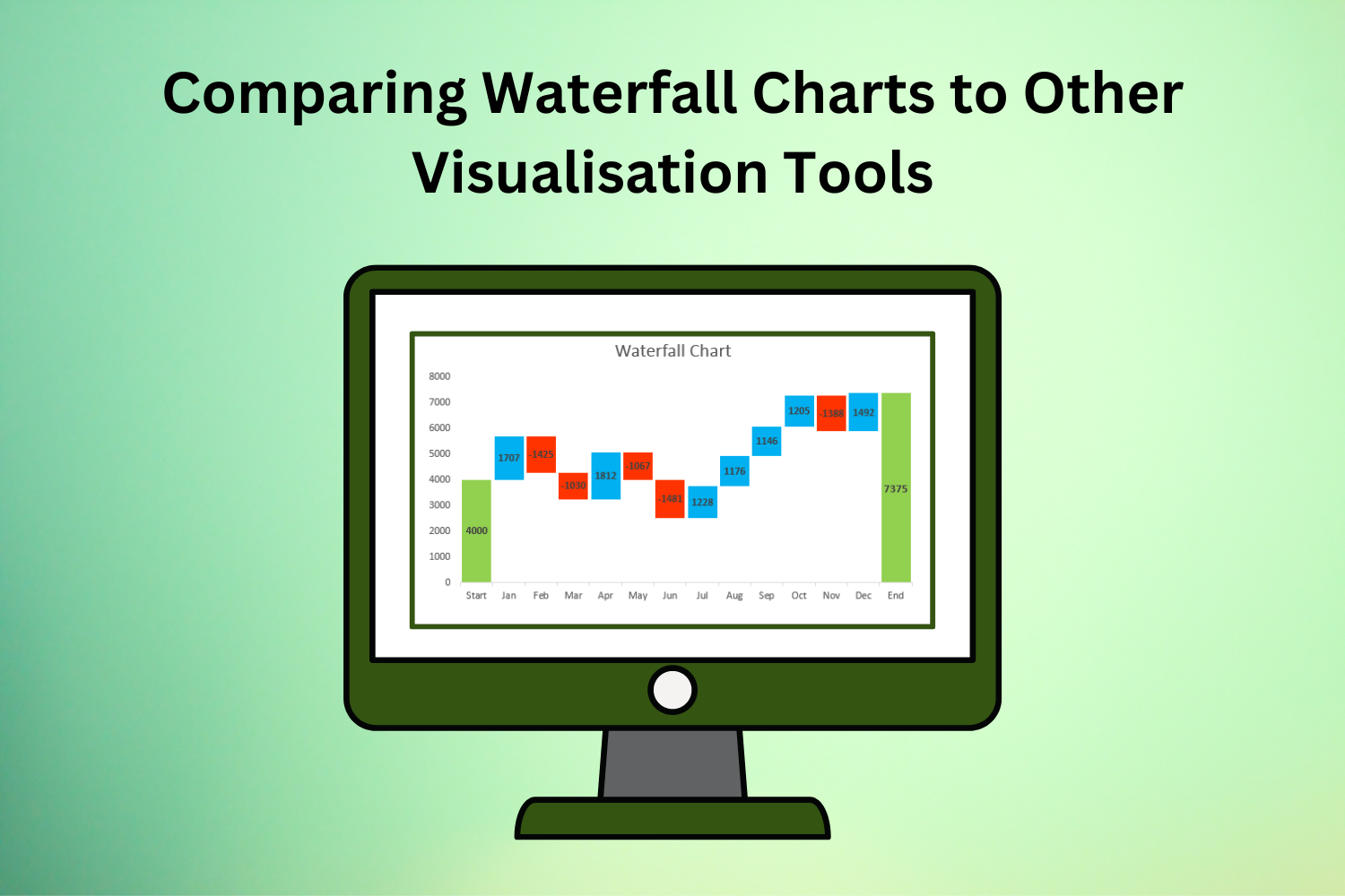
Financial and project managers frequently employ waterfall charts to show the cumulative effect of successive data points. They usually show how a beginning value evolves over time, with each step indicating a different change in value. Thus, waterfall charts can effectively show the composition of a total value and the contributions of different components to the overall change.
Key Features of Waterfall Charts
Sequential Representation
Waterfall charts make it easy to grasp the flow of changes over time or categories by sequentially illustrating data points.
Cumulative Effect
A waterfall chart shows the overall impact by adding together all the data points and how they add to the total.
Positive and Negative Values
The waterfall chart displays positive and negative data for your gains and losses.
Visual Clarity
Because of their clear and straightforward design, waterfall charts can be understood by an extensive range of people.
Comparing Waterfall Charts to Other Visualisation Tools
Waterfall charts best illustrate the consecutive changes in data, although there are better options for some visualisation scenarios. To better appreciate the benefits and drawbacks of waterfall charts, let’s compare them to other visualisation tools:
Bar Charts
Strengths: One of the bar charts’ many strengths is the ease with which it allows users to compare discrete categories or numbers. The visual representation of individual data points is straightforward, and it’s easy to compare categories with their help.
Weaknesses: One area where waterfall charts shine is in portraying cumulative impacts and sequential changes over time; bar charts might struggle.
Line Charts
Strengths: A line chart’s strength is its ability to show patterns and trends over time. It is perfect for showing changes in variables across continuous intervals because it gives a continuous representation of data points.
Weaknesses: Waterfall charts are more appropriate for depicting the cumulative effect of sequential data or discrete changes than line charts.
Pie Charts
Strengths: One of the many strengths of pie charts is their ability to show percentages and proportions. They make the contribution of each part to the whole easy to understand and visualise.
Weaknesses: Pie charts are only sometimes the best way to show cumulative effects or sequential changes since they can only sometimes show changes over time or sequential data.
Stacked Area Charts
Strengths: If you want to see how several variables affect each other over time, stacked area charts are a good choice. They show how a total value is made up and continuously changes over time.
Weaknesses: When showing many variables, stacked area charts can get visually chaotic, making them easier to read and understand.
Gantt Charts
Strengths: Gantt charts help project managers see the big picture by showing when tasks are due and how they relate. They lay out all you need to know about the project’s status and how resources are being distributed.
Weaknesses: Waterfall charts provide more clarity than Gantt charts when illustrating the cumulative impact of changes or the composition of total values.
Heatmaps
Strengths: Heatmaps’ strong points lie in its ability to visually represent and reveal trends and patterns in massive information. They make it easy to find important areas by using colour gradients to show the density or magnitude of data points.
Weaknesses: Waterfall charts offer more specificity and clarity than heatmaps when it comes to representing sequential changes or the cumulative effect of data points. Heatmaps, on the other hand, are wonderful at revealing data patterns.
Conclusion
Several factors must be considered when comparing waterfall charts to other visualisation techniques. These include data structure, visualisation aims, audience preferences, line, pie, stacked area, and bar charts. Analysts and decision-makers may convey insights more effectively and drive informed decision-making by knowing the advantages and disadvantages of various visualisation methods.
Tradersdna is a leading digital and social media platform for traders and investors. Tradersdna offers premiere resources for trading and investing education, digital resources for personal finance, market analysis and free trading guides. More about TradersDNA Features: What Does It Take to Become an Aggressive Trader? | Everything You Need to Know About White Label Trading Software | Advantages of Automated Forex Trading

")


