Hey there! So, you’re looking to get a better handle on forex charts, huh? It can seem a bit much at first, with all the lines and colors, but honestly, it’s not as complicated as it looks. Think of a forex chart as a map for currency trading. It shows you where prices have been and gives you clues about where they might go next. This guide is here to break down how to read these charts, understand what they’re telling you, and hopefully, make your trading a bit smoother. We’ll cover the basics, look at different chart types, and talk about how to build a solid strategy so you don’t get lost out there.
Key Takeaways
- A forex chart is a visual tool that displays currency price changes over time, helping traders spot trends and patterns.
- Different chart types like line, bar, and candlestick charts offer unique ways to view price action and market momentum.
- Technical analysis, using chart patterns and indicators, is key to interpreting market trends and making informed trading decisions.
- Developing a trading strategy, including setting routines and backtesting, is vital for consistent success and risk management.
- Avoiding common pitfalls such as overtrading, misinterpreting data, and emotional decision-making is crucial for protecting your capital.
Understanding the Fundamentals of Forex Charts
Alright, let’s get down to business with forex charts. Think of them as the roadmap for currency traders. Without a good map, you’re just guessing where you’re going, and in the forex market, that’s a fast way to lose money. These charts take a ton of price data and turn it into something you can actually see and understand. They show you what’s been happening with currency pairs over time, giving you clues about what might happen next.
What Are Forex Charts?
Basically, a forex chart is a visual representation of price changes for a specific currency pair, like the EUR/USD or USD/JPY. It plots prices over a certain period, letting you see the ups and downs. You’ll see different types, but they all aim to show you the price action. They can cover anything from a few minutes to several years, depending on what you’re looking at.
Why They Matter in Currency Trading
So, why bother with these charts? Well, they’re pretty important for a few reasons. First off, they help you spot trends. Is the price generally going up, down, or just moving sideways? Charts make this obvious. Second, they help you figure out where to get in and out of trades. You can see levels where prices have had trouble breaking through before – these are called support and resistance. Knowing these levels can make a big difference in your trading results. Finally, they help you manage risk. By seeing where the price has been, you can make smarter decisions about how much you’re willing to lose on a trade.
Key Components of Forex Charts
When you look at a forex chart, you’ll notice a few main things. There’s the price scale, usually on the right or left side, showing you the actual currency values. Then there’s the time scale, typically along the bottom, showing you the periods the chart covers – minutes, hours, days, and so on. Different chart types will also show you specific price points within each time period, like the opening price, the highest price reached, the lowest price, and the closing price. Some charts might also show trading volume, which is the amount of currency traded during a specific time. It’s good to know what all these bits and pieces mean so you can read the chart correctly.
Understanding these basic building blocks is the first step to making sense of the market. Don’t rush this part; a solid grasp of what you’re looking at will save you a lot of headaches later on.
Exploring Different Forex Chart Types
When you’re looking at the forex market, not all charts are created equal. Each type gives you a different window into what the currency pairs are doing. Think of it like having different lenses for a camera; some give you a wide overview, while others zoom in on the details. Choosing the right chart can really make a difference in how you see the market and what trades you decide to make.
Line Charts for Trend Identification
Line charts are probably the simplest way to look at price action. They just connect the closing prices of a currency pair over a set period. This makes them super easy to read and great for spotting the general direction the market is heading. They strip away all the day-to-day noise, so you can see the bigger picture, like whether a currency is generally strengthening or weakening over weeks or months. They’re a good starting point if you’re new to trading because they help you focus on the main trend without getting bogged down in minor price swings.
Bar Charts for Detailed Price Action
Bar charts, also known as OHLC charts (Open, High, Low, Close), give you a bit more information than line charts. For each time period you’re looking at – say, an hour or a day – you’ll see a vertical line. The top of the line is the highest price reached during that period, and the bottom is the lowest. Then, there are little horizontal marks: one on the left shows the opening price, and one on the right shows the closing price. This gives you a clearer idea of the price movement within that specific timeframe.
Here’s a quick breakdown:
- Open: The price at the start of the period.
- High: The highest price reached during the period.
- Low: The lowest price reached during the period.
- Close: The price at the end of the period.
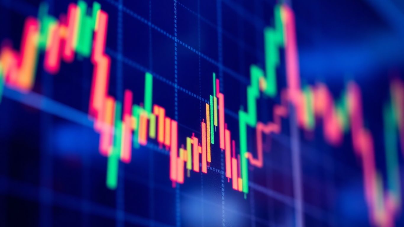
Candlestick Charts for Visual Momentum
Candlestick charts are really popular among forex traders, and for good reason. They’re like bar charts but with a visual twist. Each ‘candlestick’ represents a specific time period and has a ‘body’ and ‘wicks’ (or shadows). The body shows the range between the open and close prices. If the close was higher than the open, the body is usually colored green (or white), indicating an upward move. If the close was lower than the open, the body is red (or black), showing a downward move. The wicks extend above and below the body, showing the high and low prices for that period. The color and shape of these candlesticks can give you quick clues about the market’s momentum and potential price reversals.
Point & Figure Charts for Volatility Filtering
Point and Figure (P&F) charts are a bit different because they don’t really care about time. Instead, they focus purely on price movement. They use columns of ‘X’s and ‘O’s to show price increases and decreases. An ‘X’ column represents rising prices, and an ‘O’ column represents falling prices. A new column is only started when the price moves a certain amount in the opposite direction. This filtering process helps to remove minor price fluctuations, or ‘noise,’ that can clutter up other chart types. This makes them useful for identifying significant support and resistance levels and long-term trends without being distracted by short-term volatility.
While each chart type offers a unique perspective, understanding their strengths and weaknesses is key. A beginner might start with line charts for simplicity, but as you gain experience, you’ll likely find value in the more detailed information provided by candlestick or bar charts. Point & Figure charts offer a way to cut through the noise, which can be helpful for specific strategies.
Interpreting Market Trends with Technical Analysis

So, you’ve got your charts open, and you’re looking at all those lines and squiggles. What does it all mean? This is where technical analysis comes in. It’s basically about looking at past price movements and trading activity to figure out where the market might be heading next. Think of it like reading the weather forecast based on cloud patterns – you’re not seeing the future, but you’re making an educated guess based on what’s happened before. The goal is to turn that raw chart data into actionable insights.
Identifying Trends: Uptrend, Downtrend, and Sideways
First things first, you need to spot the general direction the market is moving. There are three main types of trends you’ll see:
- Uptrend: This is when the price is generally moving upwards. You’ll notice a pattern of higher highs and higher lows. It’s like climbing a staircase, with each step taking you a bit higher. Buyers are usually in control here.
- Downtrend: The opposite of an uptrend, where the price is generally moving downwards. Here, you’ll see lower highs and lower lows. It’s like walking down a hill. Sellers are typically the ones pushing the price down.
- Sideways (or Range-bound): This happens when the price isn’t really making a clear move in either direction. It tends to bounce between a certain high point and a certain low point. Think of it as the market taking a breather, with neither buyers nor sellers having a strong upper hand.
Support and Resistance Levels Explained
These are like invisible ceilings and floors for the price. They’re areas on the chart where the price has had trouble moving past in the past.
- Support: This is a price level where demand is strong enough to stop prices from falling further. Buyers tend to step in around this level, preventing a continued drop. It’s a floor.
- Resistance: This is the opposite – a price level where selling pressure is strong enough to stop prices from rising further. Sellers tend to appear around this level, capping any upward movement. It’s a ceiling.
When prices break through these levels, it can be a big deal. A break above resistance might signal that an uptrend is starting or continuing, while a break below support could indicate a downtrend is beginning. It’s a good idea to keep an eye on these levels; they can be found using various technical trading tools.
Recognizing Key Chart Patterns
Beyond just the general trend and support/resistance, charts also form recognizable patterns. These patterns are like little pictures that traders have learned can predict future price movements. Some common ones include:
- Head and Shoulders: Often seen as a reversal pattern, signaling a potential shift from an uptrend to a downtrend.
- Triangles (Ascending, Descending, Symmetrical): These can indicate either a continuation of the current trend or a potential reversal, depending on the type.
- Flags and Pennants: These are usually short-term continuation patterns that appear after a sharp price move.
Learning to spot these patterns takes practice, but they can give you a heads-up about what might happen next. It’s often best to confirm these patterns with other indicators, like moving averages or oscillators, to increase your confidence before making a trade.
When you’re looking at charts, remember that they’re a reflection of human psychology – fear, greed, and hope all play a part. Patterns emerge because people tend to react in similar ways to similar market conditions over time. Don’t just memorize patterns; try to understand the story they’re telling about buyer and seller behavior.
Building Your Forex Chart Analysis Strategy
Alright, so you’ve spent some time looking at charts, maybe you’ve figured out what a candlestick is and how to spot a trend. That’s cool. But just looking isn’t going to make you money, right? You need a plan. Think of it like this: you wouldn’t just wander into a casino and start betting randomly. You’d have some idea of what you’re doing, or at least, you should. Building a solid strategy turns all that chart-watching into actual trading moves.
Creating a Trading Routine
This is where you get organized. Without a routine, it’s easy to get sloppy. You need to set aside specific times to actually look at the markets and make decisions. Don’t just jump in whenever you feel like it. Here’s a basic breakdown:
- Set Aside Dedicated Time: Pick specific hours each day for your market review. Maybe it’s first thing in the morning before the markets get too wild, or perhaps after work. Whatever it is, stick to it.
- Choose Your Tools: Decide which chart types you’re comfortable with (candlesticks are popular for a reason) and which indicators you’ll use. Don’t overload yourself with too many; pick a few that make sense to you.
- Define Entry and Exit Rules: This is super important. When exactly will you get into a trade? What has to happen on the chart? And just as importantly, when will you get out? Have clear rules so you’re not just guessing.
Backtesting Your Strategies
Okay, you’ve got a plan. Now, how do you know if it’s any good? You don’t want to risk real money on something that’s just a guess. That’s where backtesting comes in. It’s like a practice run, but with historical data.
- Use Past Data: Go back in time on your charts and see how your strategy would have performed. Most trading platforms let you do this, or you can use demo accounts.
- Track Performance: Keep notes on how many trades would have been winners, how many would have lost, and what your overall profit or loss would have been. Look at things like your win rate and your average profit per trade.
- Tweak and Refine: Based on the results, adjust your rules. Maybe you need to be more selective about your entry points, or perhaps your exit strategy needs a little work. Keep doing this until the results look promising.
You’re not trying to find a perfect strategy that wins every single time. That’s impossible. You’re looking for a strategy that, over a good number of trades, shows a positive edge. It’s about consistency and managing risk, not about predicting the future with 100% accuracy.
Choosing the Right Trading Style
Not everyone is cut out for the same kind of trading. Some people like the fast-paced action of day trading, while others prefer to set it and forget it for weeks or months. Your strategy needs to fit your personality and your lifestyle.
- Day Trading: If you like constant action and can focus for long periods, this might be for you. You’re in and out of trades within the same day. It requires a lot of attention.
- Swing Trading: This is a middle ground. You hold trades for a few days to a couple of weeks, trying to catch bigger price swings. It’s less time-intensive than day trading.
- Position Trading: This is for the patient ones. You might hold a trade for months or even years, focusing on major economic trends. It requires less screen time but a strong understanding of the bigger picture.
Pick the style that best matches how much time you have, how much risk you’re comfortable with, and what kind of market movements you want to focus on. Your strategy should work for you, not against you.
Mastering How to Read a Forex Chart Effectively
So, you’ve got your charts up, and you’re looking at all these lines and shapes. It can feel a bit like trying to read a foreign language at first, right? But stick with it, because this is where the real magic happens. It’s not just about looking at pretty pictures; it’s about understanding what the market is trying to tell you.
Verifying Patterns with Volume Data
Lots of traders get excited when they see a chart pattern that looks like a winner, like a head-and-shoulders or a triangle. But here’s the thing: those patterns aren’t always what they seem. That’s where volume data comes in. Think of volume as the market’s energy. If a pattern is forming and the volume is low, it’s like a car with a weak engine – it might not have the power to go where you expect. But if the volume is high and increasing as the pattern develops, that’s a strong signal that the move is likely to be real. You want to see that volume confirming the price action.
Tracking Timeframes for Reversal Signals
It’s easy to get tunnel vision staring at just one timeframe, like a 5-minute chart. But the market operates on multiple levels. What looks like a big uptrend on a 5-minute chart might just be a small bounce within a larger downtrend on a daily chart. So, what you need to do is zoom out. Look at the bigger picture on a daily or weekly chart to understand the main trend. Then, zoom back into your shorter timeframe to find entry points. Sometimes, a small bearish candle on a 1-hour chart, appearing right at a resistance level on the daily chart, can be an early warning sign that the bigger trend is about to change. It’s all about seeing how the smaller moves fit into the larger ones.
Focusing on Context and Confirmed Breakouts
Context is everything in trading. A bullish candlestick pattern, like a hammer, is much more significant if it appears after a long downtrend and at a known support level. If that same hammer shows up in the middle of nowhere on a chart with no clear support or resistance, it might just be noise. And when it comes to breakouts – when the price moves decisively past a support or resistance level – don’t jump in too early. Wait for confirmation. That means seeing the price hold above resistance or below support for a little while, maybe on the next candle or two, and ideally with increased volume. A fake breakout can really mess up your day.
Professional traders often keep detailed journals. They write down why they took a trade, what the chart showed, and what happened. This helps them learn from mistakes and get better. It’s about being disciplined and letting the data guide your decisions, not your gut feelings.
Common Pitfalls in Forex Chart Analysis
Alright, so you’ve been studying charts, learning about patterns, and maybe even feeling pretty good about spotting trends. That’s awesome! But here’s the thing: even the most seasoned traders trip up sometimes. It’s super easy to fall into some common traps when you’re looking at forex charts, and these can really mess with your trading. Let’s talk about a few of the big ones so you can hopefully steer clear.
This one is huge. It’s like having a buffet in front of you and trying to eat everything at once. You see a bunch of potential trades, and you jump into all of them. The more trades you make, the more likely you are to lose money, especially if you don’t have a solid plan. Overtrading usually happens when you’re chasing profits or trying to make back losses too quickly. It’s tempting, I get it. But it’s a fast way to drain your account.
- Set a Daily Trade Limit: Decide beforehand how many trades you’re willing to make in a day. If you hit that number, you’re done for the day, no matter what. This forces you to be more selective.
- Stick to Your Strategy: Only enter a trade if it perfectly matches the rules you’ve already set. Don’t force a trade just because you feel like you should be trading.
- Wait for High-Probability Setups: Patience is key. It’s better to miss a few trades than to take bad ones. Wait for those setups that have a really good chance of working out based on your analysis.
Charts are supposed to give us clarity, right? But sometimes, they can be a bit misleading if you’re not careful. You might see a little blip on the chart and think, ‘Aha! A reversal!’ when it’s really just noise. Or you might try to force a pattern that isn’t really there.
- Confirm with Multiple Indicators: Don’t rely on just one thing. If you see a potential signal on a candlestick, check it against something else, like a moving average or volume data. Does it line up?
- Understand What Each Chart Shows: Remember how different chart types have different strengths? A line chart is great for big trends but hides details. A candlestick shows more, but you need to know what you’re looking at.
- Avoid ‘Patternitis’: This is when you see patterns everywhere, even where they don’t exist. Be objective. Does the pattern really fit the criteria, or are you just wishing it did?
It’s easy to get caught up in the excitement of a chart pattern, but remember that not every signal is a guaranteed win. Always look for confirmation from other tools or indicators before committing your capital. Sometimes, the most obvious signal isn’t the most reliable one.
This is probably the hardest one to deal with. Fear and greed are powerful emotions, and the forex market can swing wildly, triggering them. You might get scared and close a winning trade too early, or get greedy and hold onto a losing trade for too long, hoping it will magically turn around.
- Use Stop-Loss Orders: This is your safety net. Set a stop-loss order before you enter a trade. It automatically closes your position if the price moves against you by a certain amount, limiting your losses.
- Define Exit Points: Know when you’re going to take profits and when you’re going to cut your losses before the trade even starts. Write it down!
- Keep a Trading Journal: Track every trade you make. Note why you entered, why you exited, and how you felt. Looking back at this can help you spot emotional mistakes you’re repeating.
It takes practice, and honestly, a lot of self-awareness, to keep emotions in check. But by being aware of these common pitfalls, you’re already a step ahead in becoming a more disciplined and successful forex trader.
Wrapping It Up
So, we’ve gone through a lot about reading forex charts, from the simple line charts to the more detailed candlestick ones. Remember, it’s not just about looking at the lines and colors; it’s about understanding what they’re telling you about the market. We talked about finding those support and resistance levels, which are super important, and how to spot trends. Don’t forget that practice is key here. Using demo accounts on platforms like MetaTrader or TradingView can really help you get comfortable without risking your own money. Keep learning, stay patient, and try not to let emotions get the best of you when you’re trading. That’s how you’ll start to see real progress in the forex market.
Frequently Asked Questions
What exactly is a forex chart?
Think of a forex chart like a map for currency prices. It shows you how the price of one currency has changed compared to another over a certain time. This helps traders see if prices are going up, down, or staying the same, kind of like seeing if a road is uphill, downhill, or flat.
Why are these charts so important for trading currencies?
These charts are super important because they give traders clues about what the market might do next. They can show patterns and levels where prices often change direction. Knowing this helps traders decide when to buy or sell, which is key to making money and avoiding big losses.
What are the main kinds of forex charts I should know?
There are a few main types, like line charts, bar charts, and candlestick charts. Line charts are simple and show the overall trend. Bar charts give a bit more detail, and candlestick charts are really popular because they show a lot of information very quickly, like how high and low the price went and where it ended up.
How do I figure out if the market is going up or down using a chart?
You look at the past prices on the chart. If the prices are generally making higher peaks and higher valleys, that’s an uptrend. If they’re making lower peaks and lower valleys, it’s a downtrend. If the price just bounces back and forth in a middle range, it’s moving sideways.
What are ‘support’ and ‘resistance’ levels?
Imagine support as a floor and resistance as a ceiling for the price. Support is a price level where a currency pair has historically had trouble falling below, usually because buyers step in. Resistance is a level where it’s had trouble going above, often because sellers appear. These levels can help predict where a price might stop or reverse.
What are some common mistakes beginners make when reading charts?
A big mistake is trading too much, too fast, without a clear plan. Another is not really understanding what the chart is showing, or letting feelings like fear or excitement make decisions instead of sticking to the facts on the chart. It’s also easy to get confused by too much information, so keeping it simple at first is smart.