
So, you’ve heard about chart patterns and how they can help you trade better. Maybe you’ve even downloaded a trading chart patterns pdf. That’s a good start. But what do these shapes actually mean? They’re not just random lines on a screen; they’re like a secret language the market uses to talk to us. This guide is here to help you decode that language, turning simple diagrams into real trading insights. We’ll look at how these patterns form, what they tell us about what traders are thinking, and how you can use them to make smarter moves.
Key Takeaways
- Chart patterns are visual representations of market psychology, showing the ongoing battle between buyers and sellers.
- Continuation patterns, like bull flags and ascending triangles, suggest a trend will keep going in the same direction.
- Reversal patterns, such as double bottoms, signal that a current trend might be about to change direction.
- Using a trading chart patterns pdf as a quick reference helps in identifying patterns on live charts and builds confidence.
- Reliable pattern trading involves understanding pattern validity, calculating price targets, managing risk, and considering the broader market context.
Understanding The Power Of Chart Patterns
The Market’s Language Revealed
Think of chart patterns as the market’s way of talking. It’s not just random lines on a screen; it’s a visual story of what traders are thinking and doing. Every upswing, every downswing, every pause – it all adds up to a narrative about who’s in control, buyers or sellers. Learning to read these patterns is like learning a new language, one that can give you a serious edge.
These formations show up because lots of people are making similar decisions at the same time. When you see a pattern, it’s a clue about the collective mood – are traders feeling greedy and pushing prices up, or are they scared and selling off?
Psychology Behind The Formations
It’s easy to just see a shape, like a "head and shoulders," but the real magic happens when you understand why it forms. That peak, then a higher peak, then a lower peak? That’s not just a drawing. It shows buyers trying to push prices up, failing, and then sellers stepping in. It’s a story of hope, followed by doubt, and then often, a shift in power.
- Buyer Exhaustion: A pattern might show buyers pushing hard, but the price stops going up. This can signal they’re running out of steam.
- Seller Dominance: Conversely, a pattern could show sellers taking over, pushing prices down with force.
- Consolidation: Sometimes, prices just move sideways. This often means traders are undecided, waiting for a clear signal.
Understanding this human element – the fear and greed driving decisions – is what separates casual observers from traders who can actually use patterns effectively.
When you start seeing the psychology behind the shapes, your trading analysis changes. You’re not just identifying a pattern; you’re interpreting the market’s mood and anticipating the next move based on how people are likely to react.
Turning Patterns Into Actionable Insights
So, you’ve spotted a pattern. Now what? The goal isn’t just to collect pattern names like trading cards. It’s about using them to make smart decisions. A pattern is a hint, not a guarantee. Its real value comes when you combine it with other information.
Here’s a quick look at how patterns can guide your actions:
- Confirmation: Does the pattern line up with the overall trend? A continuation pattern in a strong uptrend is usually more reliable.
- Volume Check: Is trading volume increasing or decreasing as the pattern forms? High volume during a breakout, for example, adds weight to the signal.
- Support/Resistance: Is the pattern forming near a known support or resistance level? This can add extra significance.
By looking at these factors, you can move from simply seeing a pattern to having a clearer idea of what might happen next and whether it’s a good time to trade.
Navigating Continuation Patterns
Continuation patterns are like the market’s way of taking a quick breather before getting back to business. They show up when a trend is already in motion, and instead of reversing, the price just pauses for a bit. Think of it as a runner slowing down for a sip of water during a race – they’re not stopping, just getting ready for the next leg. For traders, spotting these is a big deal because they often signal a chance to jump into a trend that’s already proven itself. It’s less risky than trying to guess a brand new move.
The Bull Flag’s Momentum Story
The bull flag is a classic. You see a sharp, fast move upwards – that’s the "flagpole." Then, the price consolidates, usually in a slightly downward-sloping channel, forming the "flag" part. This isn’t a sign of weakness, though. It just means that after the initial surge of buying, some traders are taking small profits, and others are consolidating their positions. The main buying pressure is still there, just waiting for the right moment to push prices higher again. It’s a sign the trend is healthy, not ending. Studies have shown these patterns can predict market direction with good consistency, making them a reliable tool for trend followers. You can find more details on these patterns in a Forex continuation patterns guide.
Ascending Triangles and Pennants Explained
Ascending triangles and pennants are other common continuation patterns. An ascending triangle has a flat resistance line at the top and a rising support line, creating a triangular shape. Buyers are getting more aggressive, pushing prices higher each time, but sellers are still holding firm at a certain level. Eventually, buyers usually win out and break through that resistance. A pennant looks a bit like a small symmetrical triangle, forming after a sharp price move. It’s a short consolidation period where the market is just digesting the previous move before continuing in the same direction.
Identifying Trend Strength With Patterns
These patterns help confirm that the existing trend has staying power. They show that despite a temporary pause, the forces driving the trend (either buyers or sellers) are still in control. Here’s a quick look at what they signal:
- Bull Flag: Strong upward move followed by a brief, sideways or slightly down consolidation. Indicates continued upward momentum.
- Ascending Triangle: Higher lows meeting a consistent resistance level. Suggests buyers are building pressure to break higher.
- Pennant: A short, tight consolidation after a sharp move, resembling a small flag. Signals a brief pause before the trend resumes.
When you see these patterns form, it’s like the market is giving you a heads-up that the current direction is likely to continue. It’s not a guarantee, of course, but it’s a strong signal that the trend has more room to run.
Mastering Reversal Pattern Identification
Sometimes, the market doesn’t just keep going in the same direction. It changes its mind. That’s where reversal patterns come in. They’re like the market’s way of saying, ‘Okay, that trend is over, time for something new.’ Spotting these can save you from holding onto a losing trade or help you catch the start of a fresh move.
Recognizing The Double Bottom Formation
A double bottom looks a bit like the letter ‘W’ on your chart. It usually shows up after a downtrend. What happens is the price hits a low point, bounces up a bit, and then falls back down to that same low point. If it holds there again, it’s a strong sign that sellers are running out of steam and buyers are starting to take charge. It’s a bullish signal, meaning the price might start going up.
Spotting The End Of A Trend
Reversal patterns are the market’s way of signaling that the current push is losing steam. Think of a Head and Shoulders pattern. In an uptrend, it looks like a peak, then a higher peak (the head), and then a lower peak (the right shoulder). This shows buyers trying one last time to push prices up, but failing. The failure of that last push often means sellers are ready to take over, and the uptrend is likely ending.
Early Warning Systems For Market Shifts
These patterns act like an early heads-up that things are about to change. They’re not just random shapes; they reflect the back-and-forth between buyers and sellers. When a pattern completes, it shows a shift in who’s in control. For example, a double top shows buyers tried to push past a certain price level twice and failed. This failure gives sellers the confidence to step in.
Here’s a quick look at what makes a reversal pattern:
- Failed Momentum: The force that was driving the trend weakens.
- Price Action: Specific price movements create recognizable shapes.
- Volume Changes: Often, volume will decrease as the pattern forms and increase on the breakout.
- Confirmation: A break of a key support or resistance level confirms the pattern.
Understanding these formations is key. They help you see when a trend might be exhausted and a new one is about to begin. It’s about reading the story the price action is telling you.
Here’s a simple table to help visualize:
| Pattern Name | Signal Type | Typical Appearance | What it Means |
|---|---|---|---|
| Double Bottom | Bullish | "W" shape | Downtrend ending, uptrend may begin |
| Double Top | Bearish | "M" shape | Uptrend ending, downtrend may begin |
| Head and Shoulders | Bearish | Three peaks | Uptrend ending, downtrend may begin |
| Inverse H&S | Bullish | Three troughs | Downtrend ending, uptrend may begin |
Leveraging Your Chart Patterns PDF

So, you’ve got this PDF guide to chart patterns. That’s great! But how do you actually make it work for you, day in and day out? It’s not just about having the information; it’s about using it effectively. Think of this PDF as your personal trading assistant, always there to help you make sense of what the market is doing.
Maximizing Impact With Daily Reference
This is probably the most important part. Don’t just let the PDF sit on your hard drive. Print it out, put it next to your monitor, or keep it open on a second screen. The goal is to make it a part of your daily routine. When you’re looking at charts, glance at the PDF. See if you can spot any of the patterns you’re learning about. The more you see them, the more familiar they become, and the easier it will be to spot them on your own.
Here’s a simple way to use it daily:
- Morning Review: Before the market opens, quickly flip through the PDF. Remind yourself what a Bull Flag looks like, or what a Double Bottom signifies.
- During Trading: When you see a potential setup, pull up the PDF. Does it match any of the patterns? What does the PDF say about its reliability?
- End of Day: Review the trades you took (or considered). Did you use the PDF? Could it have helped you make a better decision?
Building Confidence Through Pattern Recognition
It’s one thing to read about a pattern in a book, and another thing entirely to see it play out on a live chart. When you can correctly identify a pattern using your PDF as a guide, and then see the price move as expected, that’s a huge confidence booster. It proves that these patterns aren’t just theoretical; they have real-world application.
This process helps you build what some traders call "market intuition." It’s not magic; it’s just repeated exposure and successful application. Your PDF is the tool that helps you get there faster.
The more you practice identifying patterns with your guide, the more you’ll start to trust your own judgment. This builds a solid foundation for making trading decisions without second-guessing yourself constantly.
From Diagrams To Practical Frameworks
Your PDF isn’t just a collection of pretty pictures. Each pattern represents a specific market scenario, a story of buyer and seller behavior. The diagrams are simplified representations, but they point to real psychological dynamics.
For example, a Head and Shoulders pattern isn’t just three peaks. It shows a market trying to go higher, failing, and then sellers taking over. Your PDF helps you translate that diagram into an actionable trading idea. It bridges the gap between abstract knowledge and practical trading steps. You’ll learn not just what the pattern looks like, but what it means for potential price direction and how to manage the trade if you decide to take it.
Essential Elements For Pattern Trading
So, you’ve got your PDF guide, and you’re starting to spot these chart patterns. That’s awesome! But just seeing a shape isn’t enough, right? We need to know what to do with it. Think of it like having a recipe book – you can see the ingredients, but you still need to know how to cook.
Defining Pattern Validity
First things first, we gotta make sure the pattern we’re looking at is the real deal. Not every triangle or flag is a signal. We need to look for specific things. For continuation patterns, like a bull flag, you want to see that strong flagpole move followed by a tight consolidation. Volume is a big clue here too. Usually, volume should drop during the flag part and then pick up again when the price breaks out. For reversal patterns, like a double bottom, you’re looking for a clear drop, a bounce, another drop that doesn’t go much lower, and then a strong move up. The more confirmation you have, the more likely the pattern is to work.
Here’s a quick checklist:
- Trend Context: Does the pattern fit with the overall market trend? A bull flag in a strong uptrend is usually more reliable than one in a choppy market.
- Volume Clues: Is volume decreasing during consolidation and increasing on the breakout?
- Structure: Are support and resistance levels clearly defined within the pattern?
- Time: Did the pattern form over a reasonable period? Patterns that form too quickly or take too long might be less reliable.
Remember, patterns are not guarantees. They are probabilities. Your job is to find the patterns that have historically shown a higher probability of success.
Direction And Target Calculation
Okay, so you’ve confirmed a valid pattern. Now what? We need to figure out where the price might go. For continuation patterns, the idea is that the trend will keep going. A common way to estimate a target is to measure the length of the "flagpole" or the initial move before the pattern formed, and then add that measurement to the breakout point. For reversal patterns, it’s a bit different. For a double bottom, for example, you’d measure the height from the bottom of the ‘W’ to the peak in the middle, and then project that distance upwards from the breakout point.
It’s not an exact science, but these methods give you a reasonable idea of where to aim. It helps you set realistic expectations for your trade.
Risk Management For Every Pattern
This is probably the most important part, honestly. No matter how pretty a pattern looks, you always need a plan for when things go wrong. This means setting a stop-loss. For a bull flag breakout, your stop-loss might go just below the low of the flag or below the breakout level. If the price moves against you and hits that stop, you get out. It’s about cutting your losses short. You also need to know when a pattern is invalidated. If a bull flag breaks downwards instead of upwards, it’s no longer a bull flag, and you should probably stay away or even consider the opposite trade if other signals align.
- Entry Point: Decide where you’ll get into the trade. Often, it’s on the breakout of the pattern.
- Stop-Loss Placement: Determine where you’ll exit if the trade goes against you. This should be a logical level based on the pattern’s structure.
- Invalidation Level: Know at what point the pattern is no longer valid and your trading idea is likely wrong.
- Position Sizing: Figure out how much you’ll trade based on your stop-loss distance and your risk tolerance. This is key to not blowing up your account.
Choosing The Right Chart For Analysis
So, you’ve got your PDF guide, full of all these cool chart patterns. That’s awesome! But here’s the thing: just knowing the patterns isn’t enough. You gotta look at them on the right kind of chart, or they might as well be invisible. It’s like trying to read a book in the dark – you need the right light, right?
Line Charts For Big Picture Trends
Line charts are super simple. They just connect the closing prices of an asset over a certain time. Think of it as the CliffsNotes version of price action. They’re great for getting a quick feel for the overall direction – is the market generally going up, down, or sideways? They really help you see the forest, not just the trees. But, they completely skip over all the daily drama, like the high and low prices for the day. For spotting long-term trends, they’re okay, but for detailed pattern work? Not so much.
Bar Charts For Detailed Data
Bar charts give you more info than line charts. For each time period (like a day or an hour), you get the open, high, low, and close prices (OHLC). You can see if the price shot up and then fell back down, or if it just slowly crept up. This is way better for seeing the price action within each period. However, most traders today find them a bit clunky to look at compared to the next option.
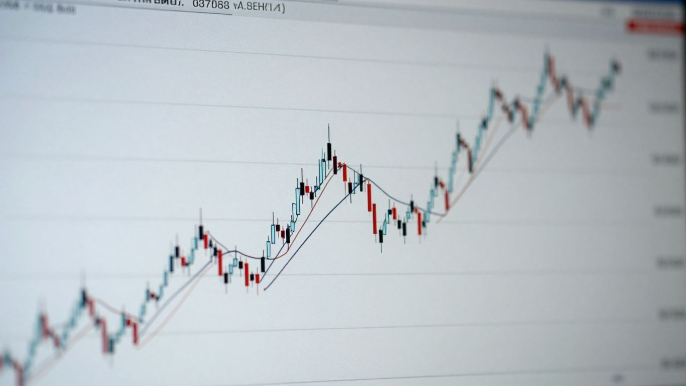
Candlestick Charts: The Trader’s Choice
This is where things get interesting. Candlestick charts show you the same OHLC data as bar charts, but they do it in a way that’s much easier to read and understand visually. Each "candlestick" has a body and wicks (or shadows). The body shows the range between the open and close price, and it’s colored in – usually green or white if the price closed higher than it opened, and red or black if it closed lower. This color coding instantly tells you who won the battle for that period: the buyers (bulls) or the sellers (bears). This visual cue is a big reason why so many traders prefer them for spotting patterns. They make the market’s story jump right off the screen. If you’re just starting out, candlestick charts are often recommended as the best option for beginners learning to read stock charts candlestick charts are recommended as the best option for beginners learning to read stock charts.
Here’s a quick rundown:
- Line Charts: Best for seeing the general trend over long periods. Simple, but lacks detail.
- Bar Charts: Shows OHLC data, giving more insight into price movement within a period. More detailed than line charts.
- Candlestick Charts: Offers OHLC data with a visual representation (colored bodies) that clearly shows the open, close, high, and low, making pattern recognition much easier. This is the go-to for most active traders.
When you’re looking for specific chart patterns, the detail and visual clarity of candlestick charts really shine. They help you see the subtle shifts in market sentiment that can signal a pattern is forming or completing. Using the right chart type is like giving yourself a clearer lens to view the market through.
Putting It All Together
So, we’ve gone through a bunch of chart patterns, from the ones that tell you a trend is likely to keep going, to the ones that hint at a big change coming. Remember, that PDF guide we talked about? It’s not just a list to stare at. It’s your buddy for when you’re actually looking at charts, trying to figure out what’s happening. Don’t try to memorize everything at once. Just start by spotting one or two patterns you feel comfortable with. The more you practice, the more natural it becomes. It’s like learning any new skill; it takes time and repetition. Keep that guide handy, use it often, and you’ll start to see the market’s story unfold right before your eyes. Happy trading!
Frequently Asked Questions
What exactly are chart patterns, and why should I care about them?
Chart patterns are like pictures that form on a stock’s price chart. They show how buyers and sellers are feeling and acting. Think of them as clues that can help you guess where the price might go next. They’re important because they help traders make smarter decisions about when to buy or sell.
Are chart patterns always right? Can I trust them 100%?
No chart pattern is a sure thing, so you can’t bet your farm on them. They work best when you use them with other tools, like looking at how much trading is happening (volume) or using other indicators. A pattern is a strong hint, not a magic crystal ball that tells the future.
What’s the difference between a pattern that continues a trend and one that reverses it?
A continuation pattern is like a green light, suggesting the current price move will keep going. A reversal pattern is more like a stop sign, warning that the price might turn around soon. Knowing the difference helps you decide if you should join a trend or get out before it changes.
How do I know if a chart pattern is real and not just a fluke?
You need to look at a few things to be sure. Check if the pattern is forming near important price levels (like support or resistance), see if the trading volume makes sense, and consider the overall market trend. These details help you pick out the patterns that are most likely to work.
Which type of chart is best for spotting these patterns?
Candlestick charts are usually the best choice for traders. They show a lot of information in a visually easy way, including the price range for a period and whether prices went up or down. This makes it much simpler to see and understand the patterns compared to other chart types like line or bar charts.
How can I use a PDF guide of chart patterns effectively?
Don’t try to memorize everything at once! Use the PDF as a quick reference tool you can look at often. Focus on identifying just one or two patterns during your trading. This hands-on practice helps you learn better and build confidence as you see the patterns work in real situations.