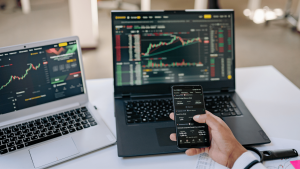
Looking at a forex market live chart can feel like staring at a bunch of squiggly lines, right? But those lines tell a story about where the money is moving. This article breaks down how to read those charts, understand what the different lines and shapes mean, and spot chances to trade. We’ll cover everything from basic chart types to more advanced tools, helping you make sense of the forex market without getting too bogged down in fancy terms. It’s all about seeing the patterns and making smarter moves.
Key Takeaways
- Different chart types like candlesticks, bars, and lines show price action in various ways. Candlestick charts are popular because they clearly show the open, high, low, and close prices for a set time.
- Timeframes matter a lot. Shorter timeframes show quick price moves, good for short-term trades but can be noisy. Longer timeframes give a bigger picture, smoothing out daily ups and downs.
- Identifying trends involves looking at swing highs and lows, and using tools like moving averages. A trend is generally confirmed when prices make higher highs and higher lows (uptrend) or lower highs and lower lows (downtrend).
- Certain chart patterns, like triangles and flags, often signal that a trend will continue. Others, like wedges, can suggest a trend might be about to reverse.
- Technical indicators like MACD help gauge momentum and identify overbought or oversold conditions. Combining different indicators can help confirm trading setups, but always remember to manage your risk.
Understanding Forex Market Live Chart Dynamics
Alright, let’s talk about what you’re actually looking at when you pull up a live forex chart. It’s not just a bunch of lines and colors; it’s a story of supply and demand playing out in real-time. Think of it as the heartbeat of the currency market. We’ve got a few main ways these stories are told, and knowing them is pretty important.
Decoding Candlestick Chart Patterns
Candlesticks are probably what you see most often. They’re like little visual summaries for a specific period, showing you the opening price, the closing price, the highest price reached, and the lowest price. If the price closed higher than it opened, the body of the candlestick is usually green (or white). If it closed lower, it’s red (or black). The thin lines sticking out, called wicks or shadows, show those high and low points. These patterns can give you quick clues about buying or selling pressure. For instance, a long green body suggests strong buying, while a long red body points to strong selling.
Interpreting Bar Charts for Price Action
Bar charts are pretty similar to candlesticks, showing the open, high, low, and close. The main difference is how they look. A bar chart has a small horizontal line to the left of the main vertical line, which is the opening price, and a small horizontal line to the right, which is the closing price. The vertical line itself shows the high and low for that period. Like candlesticks, you’ll often see them colored green if the close was higher than the open, and red if it was lower. They offer a slightly different visual way to see the same price action data.
The Role of Line Charts in Trend Identification
Line charts are the simplest of the bunch. They just connect the closing prices over a set period. So, if you’re looking at a 1-hour line chart, it’s just a line showing where the price closed at the end of each hour. They’re great for getting a quick overview of the general direction, or trend, without getting bogged down in the daily ups and downs. They smooth things out, making it easier to spot the bigger picture movement.
When you’re starting out, it’s easy to get overwhelmed by all the details on a chart. The key is to focus on what each type of chart is telling you and how it relates to the overall price movement. Don’t try to read too much into every single wiggle; look for the broader patterns and directions.
Navigating Timeframes on Your Forex Chart
When you look at a forex chart, you’ll see a bunch of options for timeframes. These can range from a single minute all the way up to a month or even longer. The most common ones you’ll see are 1-minute, 5-minute, 15-minute, 1-hour, 4-hour, daily, weekly, and monthly. Which one you pick really depends on how you like to trade and what kind of opportunities you’re looking for.
Choosing the Right Timeframe for Short-Term Trades
If you’re into quick trades, like day trading or scalping, you’ll want to focus on the shorter timeframes. Think 5-minute, 15-minute, or even 1-hour charts. These show you price action happening much faster, giving you a more immediate view. It’s like watching a movie in fast-forward – you see all the action as it unfolds. This is great for catching small moves, but you have to be quick and ready to act.
Leveraging Higher Timeframes for the Bigger Picture
On the flip side, if you prefer to hold trades for longer, or you just want to get a general sense of where the market is headed, the higher timeframes are your friend. Charts like the 1-hour, 4-hour, daily, or weekly give you a smoother view of price movements. Because each candle or bar represents a longer period, they filter out a lot of the short-term noise. This helps you see the main trend without getting distracted by every little up and down.
Understanding Timeframe Noise and Volatility
It’s important to know that lower timeframes tend to be a lot ‘noisier’. This means you’ll see more rapid price swings. These can be caused by all sorts of things – news releases, rumors, economic data, or even just random market fluctuations. While these short-term moves can sometimes offer opportunities, they can also lead to mistakes if you’re not careful. Higher timeframes generally smooth out this noise, letting you focus on the larger trend. However, even on higher timeframes, you’ll still see periods of increased volatility, especially around major economic events.
Here’s a quick look at how different timeframes might show different trends:
| Timeframe | Potential Trend Example |
|---|---|
| 5-Minute | Uptrend (Higher Highs/Lows) |
| 1-Hour | Downtrend (Lower Highs/Lows) |
| Daily | Sideways (Range-bound) |
Remember, a trend on a higher timeframe is usually considered more significant than a trend on a lower one. If you see conflicting trends, it’s often wise to pay more attention to the direction of the larger timeframe until there’s a clear sign it’s changing.
Identifying Trends with Forex Market Live Chart Tools
Figuring out the direction the market is heading is pretty important in forex trading. You don’t want to be buying when everyone else is selling, right? Live charts give us the tools to spot these movements. The key is to look for consistent patterns in price action over time.
Swing Highs and Lows for Trend Confirmation
One of the most basic ways to see a trend is by looking at swing highs and lows. Think of it like this: in an uptrend, the price keeps making higher peaks (swing highs) and higher valleys (swing lows). It’s like climbing a hill, step by step. On the flip side, a downtrend shows lower peaks and lower valleys, like going down that same hill.
- Uptrend: Higher Highs, Higher Lows
- Downtrend: Lower Highs, Lower Lows
- Sideways/Consolidation: Price moves within a range, not making significant higher highs or lower lows.
It’s not always super clear-cut, though. Sometimes, what looks like a trend on a short timeframe might be just a small blip on a longer one. You might see an uptrend on a 5-minute chart, but if you zoom out to an hourly chart, it could actually be part of a bigger downtrend. Generally, the trend on the longer timeframe carries more weight.
Utilizing Moving Averages for Trend Direction
Moving averages are like a smoothed-out version of the price. They help cut through some of the daily noise. A common one is the 50-period moving average. It calculates the average price over the last 50 periods (like 50 minutes or 50 hours). When the price is consistently above this line, it often suggests an uptrend. If it’s below, it can point to a downtrend.
- Price above Moving Average: Often bullish signal.
- Price below Moving Average: Often bearish signal.
- Moving Average Slope: An upward slope indicates an uptrend, while a downward slope suggests a downtrend.
When the price crosses the moving average, it can sometimes signal a potential shift in the trend. It’s not a crystal ball, but it’s a good indicator to keep an eye on.
Divergent Trends Across Multiple Timeframes
This is where things get interesting. You might see a currency pair moving up on a 15-minute chart but simultaneously moving down on a daily chart. This is called divergent trends. When this happens, traders often pay more attention to the longer timeframe trend. They might wait for the shorter timeframe trend to align with the bigger picture before making a trade. It’s about understanding the overall market direction versus short-term fluctuations. Advanced forex charting tools can help visualize these differences.
When you see conflicting trends on different timeframes, it’s often a sign to be cautious. It means the market is undecided, or there’s a battle between short-term traders and longer-term investors. Waiting for confirmation from the higher timeframe is usually the safer bet.
Spotting these trends isn’t about predicting the future perfectly, but about understanding the probabilities based on what the chart is showing you right now. It’s a big part of making sense of the forex market.
Key Chart Patterns for Forex Opportunities
Chart patterns are like little pictures that form on a price chart, giving us clues about what the market might do next. They’re basically a way to see what traders are thinking and feeling at different price levels. Think of them as a visual language that can help you spot potential moves before they really get going.
Recognizing Continuation Patterns: Triangles and Flags
Continuation patterns suggest that whatever trend was happening before the pattern formed is likely to keep going. They often show a pause in the action, a bit of a breather, before the price continues on its original path.
- Triangles: These look like, well, triangles! They form when the price moves between converging trendlines. A symmetrical triangle means buyers and sellers are in a stalemate, and the price could break out either way. However, descending triangles often lean towards a downside break as support gets tested repeatedly, while ascending triangles tend to break upwards as resistance is challenged. Keep in mind, though, that these aren’t guarantees, and false breakouts can happen.
- Flags: Flags appear after a sharp price move, looking like a small, rectangular consolidation. They’re usually short-lived and signal that the prior trend is just taking a quick break before resuming. Imagine a flagpole followed by a small, tilted rectangle – that’s your flag.
Spotting Reversal Patterns: Wedge Formations
Reversal patterns, on the other hand, signal that the current trend might be losing steam and could be about to change direction. They often show a gradual weakening of momentum.
- Wedges: Wedges can be tricky. They form when price action gets squeezed between converging trendlines, but unlike triangles, the trendlines usually slope in the same direction as the price. Rising wedges in an uptrend or falling wedges in a downtrend can indicate that the momentum is fading. When the price finally breaks out of a wedge, it often signals a reversal of the prior trend. It’s like the market is trying hard to keep going, but it’s running out of energy.
Analyzing Chart Patterns for Market Sentiment
Looking at these patterns isn’t just about drawing lines on a chart. It’s about understanding the psychology behind them. When you see a pattern forming, try to think about what it means for the buyers and sellers involved.
Chart patterns are a reflection of market sentiment and momentum. They show periods of consolidation or indecision, and their eventual breakout can indicate a shift in the prevailing mood of traders. Always remember that patterns are not foolproof; they are tools to help you assess probabilities.
Here’s a quick rundown of what different patterns might suggest:
- Continuation (Triangles, Flags): The trend is likely to keep going after a pause.
- Reversal (Wedges, Double Tops/Bottoms): The current trend might be ending.
- Consolidation: Price is moving sideways, indicating indecision or a buildup of energy before a move.
Spotting these patterns takes practice, and they rarely look exactly like the textbook examples. The market is messy, and you’ll see spikes and wiggles that can make things confusing. The key is to stay flexible and adapt your analysis rather than sticking rigidly to rules.
Advanced Analysis with Technical Indicators
Technical indicators are like tools in a toolbox for traders. They take price data and help make sense of what the market might do next. They don’t predict the future, but they can show us if things are speeding up, slowing down, or if the price is getting pushed too far in one direction. It’s best to use these indicators alongside other analysis, not just on their own.
Gauging Momentum with MACD
The Moving Average Convergence Divergence (MACD) is a popular indicator for looking at momentum and trend direction. It’s made up of a few parts: the MACD line, a signal line, and a histogram. When the MACD line crosses the signal line, it can suggest a new trend might be starting. The histogram shows the distance between these two lines, and big moves away from the zero line can sometimes mean momentum is getting stretched.
Understanding Overbought and Oversold Signals
Indicators like the Relative Strength Index (RSI) help us see if a currency pair’s price has moved too far, too fast. The RSI is measured on a scale from 0 to 100. When it goes above 70, it’s often seen as ‘overbought,’ meaning the price might be due for a pullback. If it drops below 30, it’s considered ‘oversold,’ and a bounce might be possible. These aren’t guarantees of a reversal, but they can signal a pause or a potential shift.
Combining Technical Tools for Higher Probability Setups
Using multiple indicators together can give you more confidence in a trade idea. For example, if you see a strong support level, like a pivot point, and your indicators also suggest that momentum is building for a move up, that’s a stronger signal than just one piece of information. It’s about finding where different tools agree. Think of it like this:
- Trend Confirmation: Moving averages show the general direction.
- Momentum Check: MACD or RSI indicate the speed and potential exhaustion.
- Support/Resistance: Chart patterns or pivot points highlight key price levels.
When these align, the chances of a successful trade setup increase. However, it’s important to remember that no setup is ever 100% certain.
The market is a game of probabilities. Your goal as a trader isn’t to be right every time, but to manage your risk so that your winning trades are larger than your losing ones. Combining indicators helps you identify scenarios with a higher likelihood of success, but always have a plan for what happens if the market moves against your expectations.
Looking at how different indicators behave together can help you spot opportunities that might otherwise be missed. It takes practice, but it’s a key part of becoming a more seasoned trader.
Developing Your Forex Chart Analysis Skills
So, you’ve been looking at charts, maybe even spotting some patterns. That’s a good start, but becoming a sharp forex analyst takes more than just recognizing shapes. It’s about building a solid approach, one that helps you make sense of the market’s constant chatter.
Thinking in Probabilities for Trading Scenarios
Forget about trying to predict the future with 100% certainty. The market doesn’t work that way. Instead, think about what’s likely to happen. When you analyze a chart, you’re not looking for a crystal ball; you’re looking for probabilities. For instance, if a price hits a level where several indicators suggest it might turn around, that’s a higher probability scenario for a bounce. But what if it doesn’t? That tells you the underlying momentum is strong enough to push through that support. So, you prepare for both outcomes: the bounce and the break. This way, you’re not caught off guard.
The Importance of Risk Management in Chart Analysis
This is a big one. Your chart analysis is only as good as your ability to manage the risks involved. Every trade setup you identify has potential downsides. You need to know how much you’re willing to lose before you even enter a trade. This means setting stop-losses and understanding position sizing. A great chart pattern can still result in a loss if you’re not careful with your risk. It’s about protecting your capital so you can stay in the game long enough to catch the profitable trades.
Here’s a simple way to think about risk:
- Define your risk per trade: Decide on a small percentage of your trading capital (e.g., 1-2%) you’re willing to risk on any single trade.
- Calculate your stop-loss: Based on your entry point and the defined risk, determine where your stop-loss order should be placed.
- Adjust your position size: Use your stop-loss distance and your defined risk to figure out how many units or lots you can trade.
- Never move your stop-loss further away: If a trade goes against you, stick to your plan. Moving your stop-loss is a common mistake that leads to bigger losses.
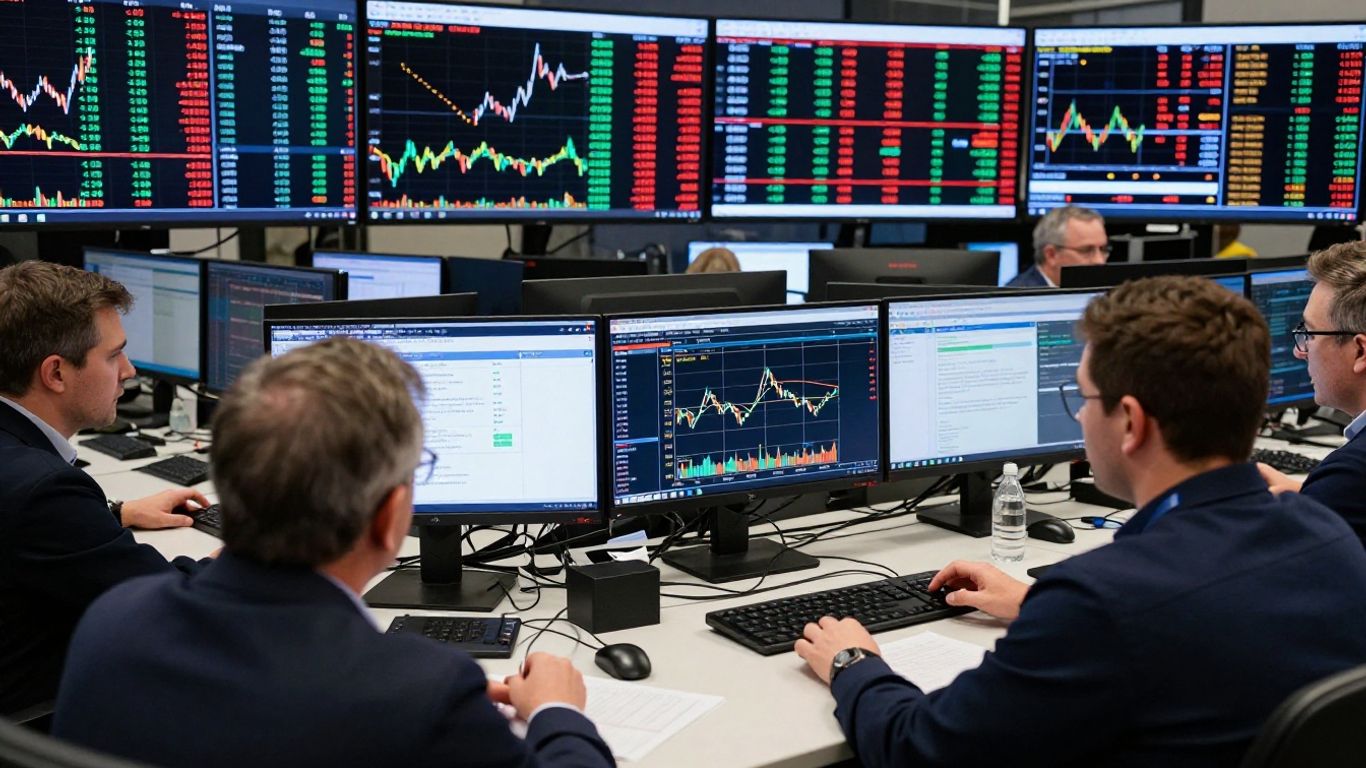
Practical Learning Through Live Chart Observation
Reading books and watching videos is helpful, but nothing beats watching the market in real-time. Pick a currency pair and a timeframe that interests you, and just observe. See how price reacts to support and resistance levels. Watch how indicators behave. Try to identify patterns as they form, not after they’ve completed. You can even paper trade – using a demo account with virtual money – to test your ideas without risking real capital. This hands-on experience is where the real learning happens. You’ll start to see how theoretical concepts play out in the messy, unpredictable reality of the forex market.
Wrapping It Up
So, looking at live forex charts is pretty much like having a map for the market. You can spot trends, see where things might be heading, and figure out if now’s a good time to jump in or maybe just watch for a bit. It takes practice, sure, and you gotta remember that charts show possibilities, not guarantees. Always keep an eye on the bigger picture, especially when you’re looking at different timeframes. And hey, don’t forget to test your ideas out before putting real money on the line. Happy trading!
Frequently Asked Questions
What exactly is forex trading?
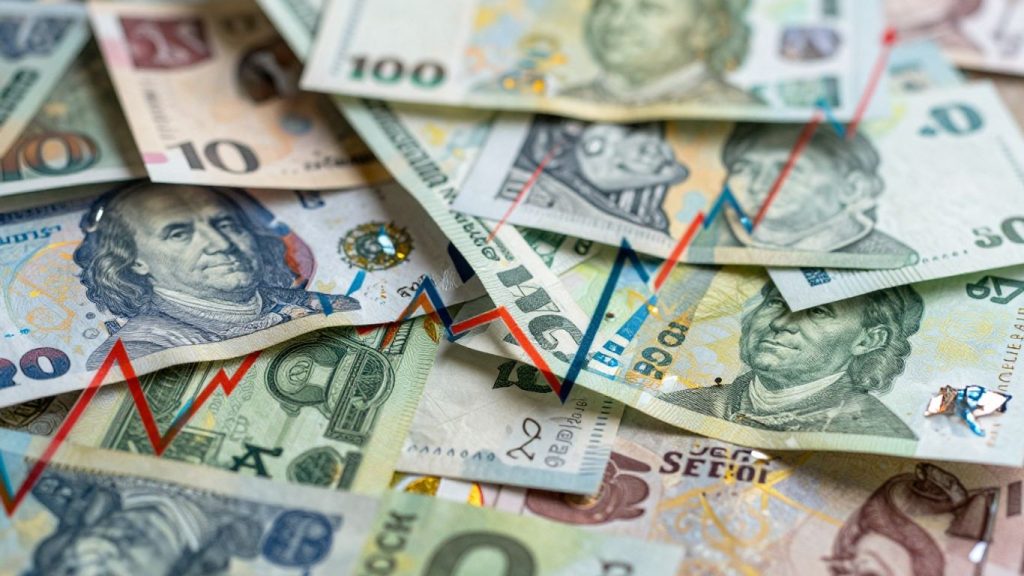
Forex, or foreign exchange, is like a giant global marketplace where people buy and sell different countries’ money. It’s not in one specific building but happens everywhere, all the time, making it super busy and easy to trade in.
How do I understand what a forex chart is showing me?
A forex chart is like a map that shows how the price of one currency changes compared to another over time. It has a line showing time going across and a line showing the price going up and down. You can look at different types of charts, like line charts, bar charts, or candlestick charts, to see the price action.
What are ‘timeframes’ on a forex chart, and why do they matter?
Timeframes are like different zoom levels for your chart. You can look at how prices moved in just a minute, an hour, a day, or even a week. Shorter timeframes show quick changes, good for fast trades, while longer ones show bigger trends, better for long-term plans. It’s important to pick the right one for your trading style.
How can I tell if a currency’s price is going up or down?
You can spot trends by looking at ‘swing highs’ and ‘swing lows’ on the chart. If the price keeps making higher tops and higher bottoms, it’s likely going up (an uptrend). If it makes lower tops and lower bottoms, it’s likely going down (a downtrend). Moving averages, which are lines showing average prices over time, can also help show the trend’s direction.
What are ‘candlestick patterns’ and why are they important?
Candlestick charts show a lot of info in a simple way. Each ‘candlestick’ tells you the starting price, ending price, highest price, and lowest price for a specific time. Certain shapes or patterns these candlesticks make can hint at whether the price might continue its trend or reverse direction, giving you clues about what might happen next.
How can I get better at reading forex charts?
To become a good chart reader, you need to practice and learn. Think of charts as showing possibilities, not guarantees. Always have a plan for what might happen if your first idea doesn’t work out, and manage your risks carefully. Watching live charts and seeing how different tools work in real situations is a great way to learn.