Hey there, fellow traders! Ever feel like you’re staring at your trading charts and just not sure what’s going on? Like, is that little squiggle a sign of good things to come, or just random noise? Well, you’re not alone. That’s why we put together this guide on trading chart patterns. It’s meant to be your go-to resource, a PDF you can actually use when you’re in the thick of it. We’ll break down the common patterns, explain why they matter, and how to spot them without getting overwhelmed. Think of it as your cheat sheet for understanding what the market might be trying to tell you. Let’s get started!
Key Takeaways
- Understand how basic candlestick shapes reveal market sentiment and potential price moves.
- Learn to identify single, double, and triple candlestick formations for stronger trading signals.
- Distinguish between patterns that suggest a trend will continue and those that signal a possible reversal.
- Discover how to use volume and the broader market context to confirm chart pattern reliability.
- Avoid common mistakes when trading patterns and learn how to use your trading chart patterns PDF guide effectively.
Understanding The Power Of Trading Chart Patterns

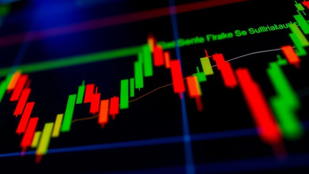
Looking at trading charts can feel like trying to read a foreign language at first. All those lines and wiggles might seem random, but there’s a method to the madness. These charts actually communicate a visual language, and within them lie specific formations known as trading chart patterns. Learning to recognize these patterns is like getting a decoder ring for the financial markets. They offer clues about where prices might head next, helping traders make more informed decisions. It’s not about predicting the future with perfect accuracy – that’s impossible – but it’s about understanding the probabilities and giving yourself an edge.
Decoding The Visual Language Of Markets
Think of chart patterns as recurring shapes that appear on price charts. These shapes are formed by the collective actions of buyers and sellers over time. They represent moments of indecision, consolidation, or strong directional conviction within the market. By studying these visual cues, traders can get a sense of the underlying market sentiment and potential future price movements. It’s a way to tap into the psychology of the market without needing to know every single participant.
Why Every Trader Needs This Chart Pattern Guide
Trying to trade without understanding chart patterns is a bit like sailing without a compass. You might get somewhere, but it’s largely guesswork. This guide is designed to be your compass. It breaks down these common formations, explains what they typically mean, and shows you how to spot them. Knowing these patterns can help you:
- Identify potential trend changes before they become obvious.
- Spot opportunities for trades that align with the prevailing market direction.
- Avoid entering trades based on weak signals or random market noise.
- Gain a clearer picture of market sentiment and participant behavior.
Understanding these patterns doesn’t guarantee winning trades, but it significantly improves your ability to make calculated decisions and manage risk effectively.
Mastering Price Action With Chart Patterns
Price action is the movement of a security’s price over time. Chart patterns are a way to interpret that price action. They are built from the highs, lows, and closing prices of a security, forming distinct shapes on the chart. These patterns are not just random occurrences; they often reflect the balance of power between buyers (bulls) and sellers (bears). When you can read these patterns, you’re essentially reading the story that the price action is telling you about the market’s next likely move.
Essential Candlestick Patterns For Quick Insights
Alright, let’s talk about the little guys that make up most of the action on your trading charts: candlesticks. These aren’t just random colored bars; they’re packed with information about what happened during a specific time period. Think of them as tiny storytellers, revealing the daily battle between buyers and sellers. Getting a handle on these basic shapes is your first step to actually understanding what the market might be up to.
Building Blocks Of Chart Formations
Every complex chart pattern is built from these individual candlesticks. Each one shows you the open, high, low, and close price for a set period, like a day or an hour. The color and shape tell you who was in charge – buyers (usually green or white) or sellers (usually red or black) – and how much ground they gained or lost. Learning to read these basic shapes is like learning the alphabet before you can read a book.
Here are a few to get you started:
- Doji: This is a sign of indecision. The open and close prices are practically the same, meaning neither buyers nor sellers could really win the day. It often looks like a plus sign or a cross.
- Hammer: You’ll see this after a downtrend. It has a small body at the top and a long lower wick, looking a bit like a hammer. It suggests that sellers tried to push the price down, but buyers stepped in and pushed it back up before the close.
- Shooting Star: This is the opposite of a hammer, usually appearing at the top of an uptrend. It has a small body at the bottom and a long upper wick. It signals that buyers tried to push the price higher, but sellers took over and pulled it back down.
These single candles are the foundation. While they can hint at what’s coming, they become much more powerful when you see them in groups or in specific places on the chart.
Identifying Single, Double, And Triple Formations
Sometimes, one candle is enough to give you a clue. But often, it’s the combination of two or three candles that paints a clearer picture, especially when you’re looking for a change in direction.
- Bullish Engulfing: This is a two-candle pattern. A small red (bearish) candle is followed by a larger green (bullish) candle that completely ‘engulfs’ the body of the previous red one. This is a strong signal that buyers have taken control.
- Bearish Engulfing: The opposite of the above. A small green candle is followed by a large red candle that engulfs it. This suggests sellers are now in charge.
- Morning Star: A three-candle pattern that often signals a bullish reversal. It starts with a long red candle, followed by a small-bodied candle that gaps down, and then a strong green candle that moves well into the first candle’s range.
- Evening Star: The bearish version of the Morning Star, signaling a potential top. It’s a long green candle, followed by a small-bodied candle, and then a strong red candle.
Understanding Immediate Market Sentiment
These patterns aren’t just pretty shapes; they reflect the psychology of the market participants. A Doji tells you traders are hesitant. A Hammer suggests buyers are fighting back. An Engulfing pattern shows a decisive shift in power. By recognizing these formations, you get a quick read on whether the market is feeling bullish, bearish, or just plain undecided. This immediate sentiment can help you make quicker decisions about your next trade, whether it’s entering a position or protecting your capital.
Key Reversal Trading Chart Patterns

Alright, let’s talk about patterns that signal a trend might be tired and ready to switch gears. Spotting these can be a game-changer, helping you get out of a trade before it goes south or catch the start of a new move. These are the patterns that tell you the market’s direction might be about to flip.
Recognizing Trend Shifts With Double Tops And Bottoms
Double tops and double bottoms are pretty common and can be quite reliable. Think of them like the market trying to break through a certain price level, failing, and then trying again. If it fails twice, it often means the current trend is losing steam.
A double top looks a bit like the letter ‘M’. It forms after an uptrend when the price hits a high, pulls back, then goes back up to that same high but can’t break through. This suggests sellers are stepping in. A double bottom, on the other hand, looks like a ‘W’ and appears after a downtrend. The price hits a low, bounces, then falls back to that same low but holds. This often signals buyers are starting to take control.
When you see these patterns, it’s smart to wait for confirmation. For a double top, you’d want to see the price break below the low point between the two tops. For a double bottom, you’d look for the price to break above the high point between the two bottoms. This break confirms the reversal.
Spotting Potential Trend Changes With Head And Shoulders
The head and shoulders pattern is another classic reversal signal, and it’s pretty distinctive. It usually shows up at the end of an uptrend and suggests a move to the downside is coming. It gets its name because it looks like a person’s head with two shoulders.
Here’s how it typically plays out:
- Left Shoulder: The price makes a high, then pulls back.
- Head: The price then rallies to a new, higher high, and pulls back again.
- Right Shoulder: The price rallies a third time, but this time it only reaches about the height of the left shoulder, and then it falls back.
- Neckline: A support line drawn connecting the lows between the shoulders and the head.
The pattern is confirmed when the price breaks below this neckline. It’s a strong indicator that the uptrend is over.
There’s also an inverse head and shoulders pattern, which is basically the opposite. It forms at the bottom of a downtrend and signals a potential move upwards. It looks like an upside-down head and shoulders, with the neckline acting as resistance that needs to be broken to confirm the bullish reversal.
When you’re looking at reversal patterns, remember that context is everything. A double top is more significant if it appears after a long, strong uptrend. Similarly, a head and shoulders pattern carries more weight if it forms after a prolonged period of rising prices. Don’t just look at the shape; consider where it’s appearing on the chart.
Interpreting Wedge Patterns For Reversals
Wedges can be a bit tricky because they can sometimes act as continuation patterns, but they are very often reversal signals, especially when they appear after a significant trend.
There are two main types:
- Rising Wedge: This pattern slopes upward, with price making higher highs and higher lows within converging trendlines. If this forms during an uptrend, it often signals that the buying momentum is weakening, and a bearish reversal is likely. The breakout usually happens to the downside.
- Falling Wedge: This pattern slopes downward, with price making lower highs and lower lows within converging trendlines. If this appears during a downtrend, it can indicate that selling pressure is easing, and a bullish reversal is on the horizon. The breakout typically occurs to the upside.
The key to trading wedges is to wait for the breakout. Don’t try to guess which way it will go before the price actually moves decisively out of the wedge. A breakout from a rising wedge below its lower trendline, or a breakout from a falling wedge above its upper trendline, is what traders look for. You can often find good trading opportunities by watching for these breakouts on the chart. Volume is also a good confirmation tool here; a strong breakout on high volume is more reliable.
Key Continuation Trading Chart Patterns
Sometimes, the market just needs a little breather before it keeps going. That’s where continuation patterns come in. They’re like a pause in the action, suggesting that whatever trend was happening before is likely to pick up right where it left off. Think of it as a runner taking a quick sip of water before the next lap. These patterns show that the current move has some serious steam behind it and isn’t ready to quit just yet. Knowing these can really help you decide whether to jump on a moving train or get off before it goes off the rails. You can learn to master crypto trend trading by understanding these formations.
Identifying Trend Persistence With Flags And Pennants
Flags and pennants are pretty common. They usually show up after a sharp, fast price move, which is like the ‘flagpole’. Then, you get this little consolidation period, looking like a small flag or pennant. What’s interesting is that these often happen on lower trading volume, which is a sign that it’s just a temporary pause, not a big change of heart from the market. The trend is likely to keep going.
Forecasting Trend Resumption With Triangles
Triangles are another type of continuation pattern. You’ve got a few kinds:
- Ascending Triangles: These have a flat top line and a bottom line that slopes upwards. They often pop up during uptrends and suggest that buyers are getting more aggressive, pushing prices higher even as sellers try to hold them back. The expectation is a breakout to the upside.
- Descending Triangles: These are the opposite, with a flat bottom and a top line that slopes down. They usually appear in downtrends. Here, sellers are becoming more persistent, and it points towards a continuation of the downward move.
- Symmetrical Triangles: These have both trendlines sloping towards each other, creating a cone shape. They show a period of indecision, where neither buyers nor sellers have a clear upper hand. The direction of the breakout from a symmetrical triangle is what traders watch closely to see where the trend will resume.
The key thing to remember with triangles is that they represent a tightening range of price action. As the pattern forms, volatility usually decreases, and traders wait for that decisive move out of the triangle to signal the next leg of the trend.
Recognizing Consolidation With Cup And Handle Formations
The cup and handle pattern is a bit more complex but can be a strong indicator of trend continuation, especially in uptrends. It looks like a teacup with a handle.
- The Cup: This is a rounded, bowl-like shape that forms after a significant price advance. It represents a period of consolidation where selling pressure eases off.
- The Handle: Following the cup, there’s a shorter, downward-sloping consolidation period, which looks like a handle. This is often characterized by lower volume.
Traders look for a breakout above the resistance level of the handle to confirm the pattern and expect the uptrend to continue. It suggests that after a period of digestion, the buyers are ready to push prices higher again.
Trading Strategies And Tips For Chart Pattern Success
Alright, so you’ve gotten pretty good at spotting these chart patterns, which is awesome. But just seeing them isn’t the whole story, right? You actually need a plan for what to do when you see one. That’s where strategies and some solid tips come in. It’s about turning that pattern recognition into actual profitable trades.
Breakout Versus Pullback Entry Strategies
When a pattern suggests a move is coming, you’ve got a couple of main ways to jump in. The first is a breakout entry, where you wait for the price to clearly punch through a key level that the pattern has been building towards. Think of a triangle pattern – you wait for the price to decisively break out of the triangle’s boundaries. This often means more momentum behind the move, which is good. But sometimes, you might get a fakeout, where the price breaks out and then immediately reverses. That’s why watching the volume is super important here; a breakout on high volume is usually more reliable.
Then there’s the pullback entry. This is a bit more patient. After the price breaks out, you wait for it to take a little step back, or ‘pull back’, towards the breakout level. If it holds that level and starts moving again, that’s your entry. This can often give you a better price and a tighter spot to place your stop loss, which is a big deal for managing risk.
Here’s a quick look at the difference:
| Entry Type | When to Enter | Pros | Cons |
|---|---|---|---|
| Breakout | Price decisively moves beyond pattern boundary | Often strong momentum | Risk of false breakouts |
| Pullback | Price retraces to boundary after breakout and holds | Better entry price, tighter stop loss | Requires more patience, pattern might not pull back |
Implementing Stop Loss And Risk Management
This is probably the most important part, honestly. No matter how good you are at spotting patterns, you need to protect your capital. A stop loss is basically an order to sell if the price moves against you by a certain amount. For chart patterns, you can often use the pattern’s structure to set your stop. For example, if you’re looking at a bullish pattern like a double bottom, you might place your stop loss just below the lowest point of that pattern. If the price drops below that, the pattern is likely invalidated anyway.
It’s also about the risk-to-reward ratio. A good rule of thumb is to aim for trades where your potential profit is at least twice the amount you’re risking. So, if you’re risking $100 on a trade, you should have a target profit of at least $200. This helps ensure that even if you have losing trades, your winning trades can more than make up for them over time.
- Define your stop loss level based on the pattern’s structure.
- Calculate your position size so that your stop loss represents a small percentage of your total trading capital (e.g., 1-2%).
- Set a profit target that offers a favorable risk-to-reward ratio.
- Consider trailing your stop loss as the trade moves in your favor to lock in profits.
Protecting your trading account is more important than chasing every single potential profit. A well-placed stop loss and a clear risk management plan are your best friends in the volatile world of trading. Don’t skip this step, ever.
Confirmation With Volume And Momentum Indicators
Chart patterns are great, but they’re even better when you get some backup. Volume is a big one. When a pattern suggests a price move is coming, you want to see that move happen with increased trading volume. High volume on a breakout, for instance, adds a lot of confidence that the move is real. Low volume during a breakout can be a warning sign.
Momentum indicators, like the Relative Strength Index (RSI) or the Moving Average Convergence Divergence (MACD), can also help. If a bullish pattern is forming and your momentum indicator is also showing upward strength, that’s a good sign. If the pattern looks bullish but the momentum indicator is weak or showing bearish divergence, you might want to be more cautious or even skip the trade. It’s all about looking for multiple signs that agree with each other before you commit your money.
Leveraging Your Trading Chart Patterns Guide Effectively
So, you’ve got this guide, right? It’s packed with all sorts of chart patterns, from the simple to the complex. But just having it isn’t going to make you rich. You’ve got to actually use it. Think of it like a toolbox; you wouldn’t just leave your tools sitting there, would you? You’d pick the right one for the job.
Using Your Chart Pattern Cheat Sheet
This cheat sheet is your go-to for quick checks. When you spot something on your chart that looks like a pattern, pull up the guide. The goal is to quickly confirm if what you’re seeing matches the characteristics of a known pattern. Don’t just guess. Look for the specific shapes, the volume spikes (or lack thereof), and where it’s appearing in the overall market trend. It’s about being methodical.
Here’s a quick way to approach it:
- Identify a potential pattern: You see a formation on your chart that resembles something in the guide.
- Compare with the guide: Open your guide and find the closest match. Pay attention to the visual representation.
- Check the criteria: Does it have the right number of candles? Are the bodies and wicks in the correct proportion? Is the volume consistent with the pattern’s typical behavior?
- Note the context: Where is this pattern showing up? Is it at the top of an uptrend, the bottom of a downtrend, or in the middle of a sideways move?
This process helps you filter out noise and focus on setups that have a higher chance of playing out as expected.
Integrating Patterns With Other Technical Tools
Chart patterns are great, but they work even better when you don’t use them in isolation. Think of them as one piece of a bigger puzzle. What else can you use? Well, things like moving averages can tell you about the overall trend. Support and resistance levels show you where price might stall or bounce. RSI or MACD can give you additional confirmation.
| Tool/Indicator | Purpose |
|---|---|
| Moving Averages | Identify overall trend direction |
| Support/Resistance | Pinpoint potential price turning points |
| RSI/MACD | Gauge momentum and potential overbought/sold conditions |
Using these tools together can give you a more complete picture than relying on patterns alone.
Learning From False Signals When Patterns Fail
Not every pattern works out. Sometimes, a bullish pattern will appear, and the price will just keep dropping. These are called false signals, and they happen. The important thing is not to get discouraged. Instead, view them as learning opportunities. Every failed pattern is a chance to refine your analysis and improve your trading strategy.
When a pattern doesn’t play out as expected, take a moment to review what might have gone wrong. Was the volume weak? Did the price break back into the pattern? Did other indicators contradict the pattern’s signal? Understanding these nuances will help you become a more discerning trader over time, reducing the impact of false signals on your portfolio.
Mastering Chart Pattern Trading
So, you’ve spent time learning about all these different chart patterns, from the classic double tops to the more subtle cup and handles. That’s a great start, but knowing what a pattern looks like is just one piece of the puzzle. The real magic happens when you start putting that knowledge to work in the live market. It’s a bit like learning to cook; you can read all the recipes you want, but until you actually get in the kitchen and start chopping, stirring, and maybe burning a few things, you’re not really cooking.
The Art And Science Of Pattern Trading
Trading chart patterns is definitely a mix of both. There’s the science part – the objective stuff, like measuring the height of a head and shoulders pattern to estimate a price target or noting the volume surge on a breakout. This is where you rely on the technical rules and definitions. But then there’s the art. This involves your intuition, your experience, and your ability to read the ‘feel’ of the market. Sometimes a pattern might look textbook perfect, but the overall market sentiment just feels off. Or maybe a slightly imperfect pattern forms, but everything else – the news, the economic data, the general mood – suggests it’s going to work. Learning to blend these two aspects is what separates a beginner from a seasoned trader. It’s about understanding the ‘why’ behind the pattern, not just the ‘what’.
Continuous Learning And Practice
This isn’t a skill you pick up overnight. You’ve got to put in the hours. Think about it: how many times did you look at charts before you started recognizing these patterns? Now, imagine doing that consistently, day in and day out. It’s about repetition. You can practice by going back through historical charts – what we call ‘backtesting’. See how a pattern played out in the past. Did it lead to the expected move? What was the volume like? What happened next? This helps build your confidence and refine your eye. Many platforms even let you use a ‘demo account’ where you can trade with fake money. It’s a safe way to test your strategies without risking your actual cash. And don’t forget to keep a trading journal. Write down every trade you take, why you took it, what pattern you saw, and what the result was. This is gold for figuring out what works for you and what doesn’t.
Here’s a quick look at how you might track your pattern trades:
- Pattern Identified: (e.g., Bullish Flag)
- Entry Price: (e.g., $50.50)
- Stop Loss Level: (e.g., $49.00)
- Profit Target: (e.g., $55.00)
- Outcome: (e.g., Hit Target, Stopped Out, Partial Profit Taken)
- Notes: (e.g., Volume confirmed breakout, RSI was overbought)
Adapting To Evolving Market Conditions
Markets aren’t static. They change. What worked perfectly last year might be less effective today. New trends emerge, and sometimes old patterns behave differently. You can’t just set it and forget it. You need to stay flexible. If a pattern isn’t playing out as expected, don’t force it. Be ready to adjust your stop losses, take partial profits, or even exit a trade if the conditions change. Think of it like a sailor adjusting their sails based on the wind. You’re not fighting the market; you’re working with it. This means staying updated on market news, understanding broader economic trends, and being willing to tweak your approach. The traders who succeed long-term are the ones who keep learning and adapting.
The most successful traders don’t just know patterns; they understand market dynamics and are disciplined enough to stick to their plan, even when emotions run high. They treat trading like a business, with clear rules and a focus on managing risk above all else.
Wrapping It Up
So, we’ve gone through a bunch of chart patterns, from the ones that suggest a trend will keep going to the ones that hint at a change. Remember, these patterns aren’t magic crystal balls. They’re tools, like a compass for your trading journey. Use them alongside other things you look at, like volume or support levels, to get a clearer picture. Don’t get discouraged if a pattern doesn’t work out perfectly; that happens. The main thing is to keep practicing, keep learning, and always manage your risk. With time and patience, you’ll get better at spotting these formations and using them to make more informed decisions. Happy trading!
Frequently Asked Questions
What exactly are trading chart patterns?
Think of chart patterns as pictures that show up on a stock or currency chart. These pictures are made by the ups and downs of prices over time. They can help traders guess where the price might go next, like a weather forecast for the market.
Are chart patterns always right?
Not always! Chart patterns are like clues, not guarantees. They work best when you use them with other tools, like looking at how much stuff is being bought and sold (volume). It’s like using a map and a compass together – they help, but you still need to be careful.
Which chart patterns are the most important to learn first?
It’s good to start with the basics. Learning about simple patterns like ‘flags’ and ‘pennants’ that show a trend will likely continue is a great first step. Then, you can move on to patterns that suggest a trend might change direction, like ‘head and shoulders’.
Can I use chart patterns for any type of trading?
Yes! Chart patterns are like a secret language that prices speak. You can see them in stocks, currencies (forex), or even digital money (crypto). They show up wherever people are buying and selling, and that happens everywhere.
What’s the difference between a continuation pattern and a reversal pattern?
A continuation pattern is like a pause in a race. The runner stops for a moment but then keeps going in the same direction. A reversal pattern is like the runner suddenly turning around and going the other way. One says ‘keep going,’ the other says ‘watch out, a change might be coming’.
How can I get better at spotting chart patterns?
Practice makes perfect! The more charts you look at, the better you’ll get. Using a cheat sheet that shows you what patterns look like can help you quickly check what you’re seeing.