
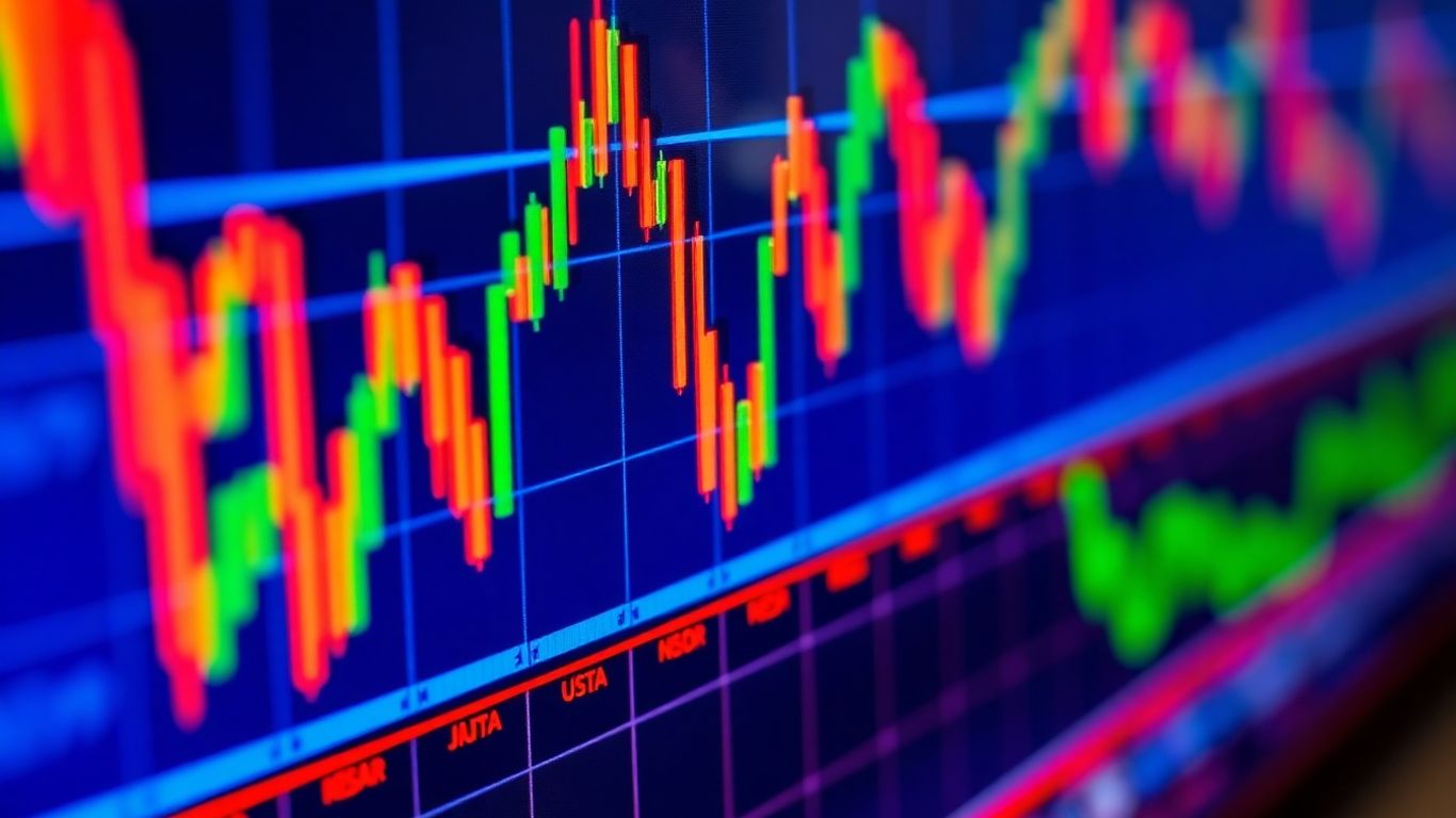
Ever look at a trading chart and feel like you’re staring at a rainbow exploded? Yeah, me too. It turns out, the colors on your charts aren’t just for show. They can actually tell you a lot about what the market’s doing, if you know what to look for. We’re going to talk about how to use trading chart colors to make things clearer, not more confusing. Think of it like learning a new language, but instead of words, we’re using colors to understand the market better. It’s not as complicated as it sounds, and it can really help you make smarter trading moves. Let’s get those charts looking good and working harder for you.
Key Takeaways
- Trading chart colors act as a visual language, helping traders quickly understand market conditions and signals from indicators.
- Smart color choices, like adjusting transparency and contrast, make charts easier to read, especially during busy or quiet market periods.
- Implementing dynamic color logic, such as using RGB values and creating custom palettes, allows for precise and intuitive chart visualizations.
- Advanced techniques like color gradients and adaptive colors can show smooth transitions and react to changing market volatility.
- Avoiding common pitfalls, like using too many colors or making poor color choices, is vital to ensure charts communicate the intended message effectively without causing distraction.
Understanding The Power Of Trading Chart Colors
Colors on trading charts aren’t just for looks; they’re a whole language. Think about it – a red light means stop, green means go. Trading charts work the same way, but with more nuance. The right colors can make complex data instantly understandable, helping you make faster, better decisions. It’s like having a secret decoder ring for the market.
Visual Language For Trading Indicators
Indicators on your charts, like moving averages or RSI, often use color to show you what’s happening. A rising moving average might be green, while a falling one is red. This visual cue tells you the trend direction without you having to read a bunch of numbers. It’s a quick way to get the gist of what the indicator is saying. If you’re building your own indicators, choosing colors wisely means people can understand them much faster. It’s about making your tools speak clearly.
Enhancing Chart Readability And Decision Speed
Have you ever looked at a chart that’s just a mess of lines and numbers? It’s overwhelming. Using color effectively cuts through that clutter. For instance, you can color price bars based on whether they closed higher or lower than they opened. This simple change makes it easy to see at a glance if the market was bullish or bearish on any given period. This immediate visual feedback speeds up your analysis significantly. When you can see trends and patterns more clearly, you can react quicker to market changes.
Communicating Market Conditions Clearly
Colors can also communicate broader market conditions. You might use a specific color for periods of high volatility, perhaps a bright yellow or orange, to signal caution. Conversely, a calm, muted color could represent a period of low activity. This helps you tailor your trading strategy to the current market environment. It’s like the weather report for your trading day – knowing if it’s sunny, cloudy, or stormy helps you decide what to wear, or in this case, how to trade.
Using color effectively is about more than just aesthetics; it’s about creating a more intuitive and efficient trading experience. It transforms raw data into actionable insights that are easy to grasp.
Strategic Color Choices For Enhanced Visibility

Picking the right colors for your trading charts isn’t just about making things look pretty; it’s about making them work better. Think of it like choosing the right tools for a job – the wrong ones make everything harder. We want our charts to be clear, fast to read, and tell us what’s happening without a lot of fuss.
Adapting Transparency Based On Price Movement
Sometimes, you want your chart elements to really pop when the price is doing something significant, and fade back a bit when things are calm. Transparency is your friend here. You can set up your indicators or price bars so they become less transparent (more solid) when there’s a big price swing. This way, you get an instant visual cue that something important is happening. When the price action slows down, the colors can become more see-through, so they don’t clutter the chart.
Here’s a simple idea:
- High Movement: Less transparency (e.g., 20% visible) – grabs your attention.
- Low Movement: More transparency (e.g., 50% visible) – stays in the background.
- No Movement: Maximum transparency (e.g., 80% visible) – almost disappears.
This helps you focus on the action without being overwhelmed by constant color.
Improving Contrast Against Different Backgrounds
Charts can have different backgrounds – light themes, dark themes, or even custom colors. A color that looks great on a dark background might disappear on a light one, and vice-versa. To fix this, you need colors that have good contrast. This often means using brighter, more saturated colors, or colors that are far apart on the color wheel from your background. You can also adjust the color’s intensity. For example, a bright blue might work well on a dark background, but on a light one, you might need a slightly darker or more vibrant shade of blue to make it stand out.
Choosing colors that stand out against both light and dark chart themes is key. It means your signals remain clear no matter how you prefer to view your market data.
Ensuring Readability During Quiet Market Periods
When the market is moving slowly, or you’re looking at indicators that don’t change much, it’s easy for chart elements to become visually noisy or just plain boring. You don’t want your colors to be so bright or distracting that they make it hard to see the actual price action when it’s subtle. The trick is to use colors that are noticeable but not aggressive. Think softer tones or colors with a moderate level of transparency. This way, even during slow periods, your indicators are present and readable without shouting for attention. It’s about finding that sweet spot where the color is there when you need it, but doesn’t get in the way when you don’t.
Implementing Dynamic Color Logic
Alright, so we’ve talked about how colors can make charts look nice, but what if we could make them work for us? That’s where dynamic color logic comes in. It’s about making your charts smarter, so they change colors based on what the market’s actually doing. Think of it like a mood ring for your trading data.
Creating Trader-Friendly Color Palettes
First off, let’s get some colors that don’t hurt your eyes. You don’t want super bright, jarring colors all the time. We want colors that are easy to look at, even if you’re staring at the screen for hours. This means picking colors that have some transparency, so they blend in a bit but still give you the info you need. It’s like choosing a comfortable shirt versus a neon sign.
Here are a few ideas for palettes:
- Calm & Clear: Use softer blues, greens, and grays. Transparency is key here, maybe around 20-50%.
- Alert & Action: Reserve bright reds, oranges, or yellows for when something important is happening. Make these less transparent, maybe 0-10%.
- Neutral Base: Have a default color, like a muted gray or a very light blue, for when nothing specific is going on. This keeps the chart from looking too busy.
Coloring Price Action Intelligently
This is where the magic happens. We can tell the chart to change color based on simple things, like whether the price closed higher or lower than it opened. It sounds basic, but it makes a huge difference.
- Green for Up: If the closing price is higher than the opening price for a period (like a candlestick), make it green. This is pretty standard, but we can tweak the shade.
- Red for Down: Conversely, if the closing price is lower, make it red. Again, the shade matters.
- Subtle Shifts: Instead of just solid colors, you can use transparency to show strength. A strong up move might be a solid green, while a tiny uptick could be a very light, almost transparent green.
The goal here is to make the chart tell a story at a glance. You shouldn’t have to squint or do mental math to figure out if the market is moving up or down. The colors should do that heavy lifting for you.
Using RGB Values For Precise Control
Sometimes, the built-in colors just aren’t enough. That’s where RGB (Red, Green, Blue) values come in. You can mix these values to create literally millions of colors. This gives you total control. For example, if you want a specific shade of teal that’s not in the default palette, you can create it using RGB. You can also control the transparency using a fourth value, often called ‘alpha’. This lets you get really specific with how visible your colors are, which is super handy when you’re trying to layer indicators or make sure one color doesn’t completely hide another. It’s like being a painter with an infinite palette.
Advanced Trading Chart Color Techniques
Alright, so we’ve talked about the basics and how to make your charts pop. Now, let’s get into some of the more sophisticated ways you can use colors to really get a grip on what the market’s doing. This is where you move beyond just red for down and green for up and start building a more nuanced visual language.
Creating Professional Color Gradients
Sometimes, a simple color change isn’t enough. You’ve got situations where things are moving from one extreme to another, and you want to see that transition smoothly. That’s where color gradients come in handy. Think of it like a dimmer switch for your colors instead of just an on/off switch. For instance, you can make an indicator like the RSI shift its color gradually from a deep red when it’s oversold, through various shades of orange and yellow, all the way to a vibrant green when it’s overbought. This gives you a much better feel for just how oversold or overbought the market is, rather than just a binary signal.
Here’s a quick look at how you might set up a gradient for an RSI:
- Define your levels: Decide what counts as oversold (e.g., 30) and overbought (e.g., 70).
- Pick your end colors: Choose the colors for these extreme points (e.g., red for oversold, green for overbought).
- Let the system blend: Use a function that automatically creates the intermediate colors between your defined levels. This way, a reading of 40 will have a different shade than a reading of 60.
Using gradients means you’re not just seeing a color, but you’re seeing a spectrum of intensity. It’s like looking at a weather map where different shades of blue show varying degrees of cold, rather than just a single ‘cold’ color.
Adaptive Colors For Market Conditions
Markets aren’t static, so why should your chart colors be? Adaptive colors are all about making your indicators react to the current market environment. A great example is adjusting the transparency of your volume bars. When the market is really active and volatile, you want those bars to be bold and grab your attention. But when things are quiet, you don’t want them cluttering up the chart. So, you can set up your colors so that higher volatility means less transparency (more visible), and lower volatility means more transparency (fades into the background). This way, the important signals naturally stand out when you need them to. You can even tie this to market liquidity insights.
Here’s a way to think about it:
- Measure the condition: Use something like the Average True Range (ATR) to gauge volatility.
- Link condition to appearance: If volatility is high, make the color more opaque. If it’s low, make it more transparent.
- Combine with price action: Keep the base color logic (e.g., green for up, red for down) while adjusting the transparency.
Managing Multiple Color Conditions Effectively
When you start using several indicators or conditions, your chart can quickly become a rainbow mess. The trick is to manage these multiple color conditions in a smart, organized way. This often involves setting up a priority system. For example, maybe a strong uptrend signal should always be green, but if there’s also a sign of extreme overbought conditions, that might override the green and turn it red. You need to define which condition takes precedence.
Think about setting up your logic like this:
- Define each condition separately: Is it an uptrend? Is volatility high? Is it overbought?
- Assign a priority: Decide which condition is most important if multiple are true at once.
- Apply the color based on priority: Check the highest priority condition first. If it’s met, use its color. If not, move to the next priority, and so on.
- Have a default: Always have a fallback color for when none of your specific conditions are met. This keeps the chart from becoming blank.
This structured approach stops your charts from looking like a kid’s finger-painting project and makes them a powerful analytical tool.
Leveraging Colors For Trading Alerts
Color-Based Signal Generation
Colors on your trading charts aren’t just for looks; they can actually be your first line of defense for spotting important market shifts. Think of them like a visual Morse code, flashing out signals that you can pick up on almost instantly. Instead of constantly staring at numbers, you can train your eyes to recognize patterns in color. This is especially handy when you’re juggling multiple charts or trying to keep an eye on different assets. The goal is to make your charts work harder for you, alerting you to potential opportunities or risks without you having to manually check every single detail.
Triggering Alerts On Volatility Spikes
Volatility is a big deal in trading, and colors can be a fantastic way to highlight when things are getting choppy. You can set up your charts so that certain indicators or price bars change color when volatility crosses a specific threshold. For instance, you might have your candlestick colors shift from a standard green to a bright, attention-grabbing yellow when the Average True Range (ATR) spikes above its recent average. This visual cue tells you that the market is becoming more active, and it might be time to pay closer attention or adjust your position sizing. It’s like a built-in early warning system.
Here’s a quick rundown of how you might set this up:
- Define Volatility: Use an indicator like ATR to measure how much prices are moving.
- Set a Threshold: Decide what level of volatility you consider significant – maybe it’s when the ATR is 20% higher than its 20-day moving average.
- Assign Colors: Program your chart to change the color of price bars or an indicator line when the volatility threshold is met.
- Create Alerts: Link these color changes to actual audible or pop-up alerts so you don’t miss the signal.
Visual References For Automated Systems
If you’re into automated trading, colors can play a role in how your system operates or how you monitor it. You can use specific colors to represent different states or signals that your algorithm is acting upon. For example, a particular moving average might turn bright red when your system is about to enter a short position, or a background highlight could flash blue when it’s in a strong buy signal. This gives you a quick visual confirmation of what your automated system is doing, even if you’re not looking at the raw code or order logs. It’s a way to bridge the gap between complex algorithms and simple visual understanding. You can explore many community-built tools that might help with this on Pine Script® publications.
Using color effectively for alerts means creating a system that’s intuitive. You want colors that stand out when needed but don’t clutter the chart during normal conditions. The key is consistency and a clear logic behind each color choice, so you always know what a specific hue signifies.
Avoiding Common Pitfalls In Color Usage
Using colors on trading charts can really help you see things faster, but it’s super easy to mess it up. When you get it wrong, it’s not just annoying; it can actually make you miss important stuff or even make bad calls. Think of it like trying to read a book with a really distracting cover – you just can’t focus on the words.
The Impact Of Poor Color Choices
Bad color choices are more than just an eyesore. They can actively work against you. Imagine a chart where every indicator is screaming with bright, clashing colors. It’s like being in a room with a dozen people talking at once – you can’t pick out any single conversation. This visual noise makes it tough to focus on what the price action is actually doing. The goal is clarity, not confusion. If your colors are making it harder to understand the market, you’re doing it wrong.
Avoiding Distractions With Too Many Colors
One of the biggest mistakes people make is throwing every color imaginable onto their charts. You’ve got your candlestick colors, your moving average colors, your RSI colors, your MACD colors, and maybe even some custom indicator colors thrown in for good measure. It gets overwhelming fast. It’s better to stick to a few key colors that represent specific things you’re watching for. For example, you might use green for bullish signals, red for bearish ones, and maybe a neutral blue or gray for general trend lines. This keeps things clean and makes it easier to spot what matters. You can find some great examples of how to do this effectively in data visualization best practices.
Here’s a quick way to think about it:
- Too Many Colors: Leads to visual clutter and makes it hard to focus.
- Conflicting Colors: Colors that don’t make sense together can be jarring.
- Inconsistent Use: Using the same color for different things confuses the message.
Ensuring Colors Convey The Right Message
Every color choice should have a purpose. Does that bright yellow really mean what you think it means? Or did you just pick it because it looked nice? It’s important that your colors align with common trading interpretations. Red usually means down or danger, green means up or good. If you’re using red for an uptrend, you’re going against the grain and potentially confusing yourself and anyone else looking at your chart. It’s about building a consistent visual language that works for you.
When you’re setting up your chart colors, always ask yourself: ‘What am I trying to communicate with this color?’ If the answer isn’t immediately obvious, it’s probably time to rethink that choice. Keep it simple, keep it consistent, and make sure the colors are actually helping you trade better, not just look prettier.
Trying to manage too many color conditions can get messy. A good approach is to define your conditions clearly first, then assign colors based on a priority system. This way, if multiple conditions are met, the most important one dictates the color, preventing conflicting signals. It makes your charts much easier to follow, especially during busy market periods.
Putting It All Together
So, we’ve gone over how colors can really change how you see your trading charts. It’s not just about making things look pretty; it’s about making the information clearer and faster to understand. Whether you’re using simple up/down colors or more complex gradients that show market conditions, getting the colors right helps you spot opportunities and risks quicker. Don’t just stick with the default settings. Take a little time to tweak the colors in your indicators and charts. You might be surprised at how much easier trading becomes when your charts actually talk to you. It’s like finally getting a clear map instead of just a bunch of scribbles. Happy charting!
Frequently Asked Questions
Why do my chart colors look different on TradingView than I expect?
Sometimes colors don’t show up exactly how you planned. This can happen because of the transparency levels you set (how see-through the color is), the specific RGB color codes you used, or how your colors interact with the chart’s background theme. It’s also good to check how they look during different times of the day when the market might be more active or quiet.
How can I make my indicator colors stand out better?
To make your colors pop, especially against different chart backgrounds, you can adjust their brightness and transparency. Using brighter base colors and setting the transparency so the color is more visible during big price changes, but still readable when things are calm, helps a lot. This way, your indicator catches the eye when it needs to.
What’s the best way to handle many different color rules on one chart?
When you have lots of color rules, it’s smart to keep them organized. You can set up your rules clearly, deciding which rule is most important if multiple apply. For example, you might want to show a strong uptrend in green, but if the market is also super shaky, maybe yellow takes priority. Having a default color for when no special rules apply also keeps things tidy.
Can colors be used to create trading alerts?
Absolutely! Colors can be more than just pretty pictures. You can set up your system so that when a specific color appears (like red for high volatility), it automatically triggers an alert. This is a great way to get notified about important market events without having to stare at the screen all day.
What are ‘color gradients’ on trading charts?
Color gradients are like smooth blends of colors instead of sudden changes. Imagine a sunset where the colors slowly shift from orange to purple. On charts, a gradient can show a gradual change in something like market momentum. For instance, as a condition moves from ‘normal’ to ‘extreme,’ the color might slowly shift from blue to bright red, making the transition easier to see.
Why is it bad to use too many different colors on a chart?
Using too many colors can be really distracting. It’s like trying to listen to five people talking at once – it’s hard to focus on any one thing. Each color should have a clear purpose, like showing an uptrend or a warning signal. If every part of the chart is a different, bright color, it becomes visual noise and makes it harder to spot the important information you actually need to make trading decisions.