


Historical positions ratios can be a useful tool when using sentiment analysis techniques to inform forex trades. They show the percentage ratio of long (buy) positions to short (sell) positions over time, and these can be interesting to compare side-by-side, or overlaid on the same graph, with the price movements over that same time period. These ratios are broker-specific, in that they only show the position ratios for traders that use a specific brokerage. This means that they do not necessarily reflect the sentiment of the market as a whole, but they are nonetheless useful for analyzing the aggregate reactions of online traders to the information that is presented to them.
Where to Find This Data
This data is not available from all brokers, and the way in which it is presented varies from brokerage to brokerage. However, if you learn how to interpret this type of data using a set of graphs from one brokerage, you may find that the same principles apply when it is presented in different ways. One firm that does provide this data is Canadian brokerage Oanda, which provides it in the form of two sentiment analysis tools, which we shall explain here. Other similar tools include DukasCopy’s SWFX Sentiment Index and FXCM’s Speculative Sentiment Index (SSI).
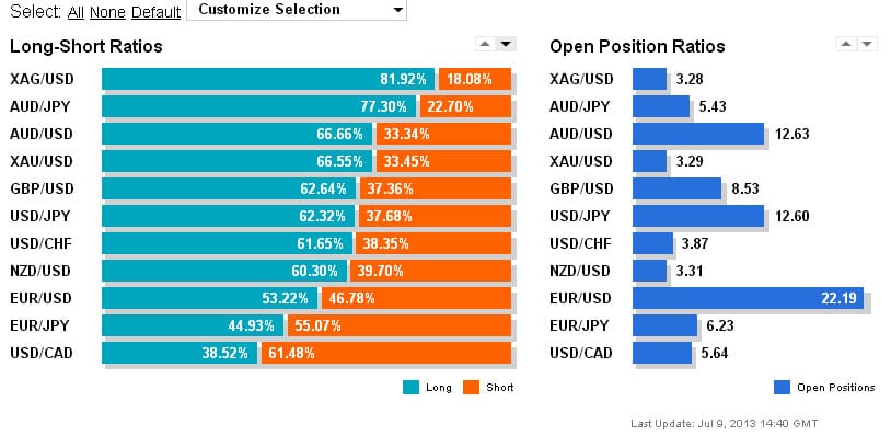
The first graph shows a breakdown of current forex open position ratios for major currency pairs among Oanda customers, and is updated every 20 minutes. The bars are split into two colours, with the blue portion to the left displaying the percentage of long positions taken on that currency pair, and the orange portion showing the percentage of short positions for the same pair. This is accompanied by a second graph (right) that gives a breakdown of the percentage of total open positions on the broker’s order book that correspond to each of the major currency pairs. It should be noted that minor currency pairs are not included in the calculations, hence the percentages of these major currency pair open positions always adding up to 100%.
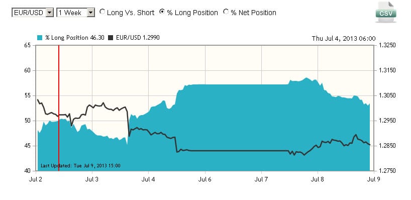
The second graph show the long to short ratios for a given currency pair over time, in this case EUR/USD, among Oanda customers. When the ratio is more than 50%, it means that there are more long positions than short positions being taken, and when it is below 50% it means that there are more short positions than long positions being taken. If, for instance, we had a ratio of 70% for EUR/USD, this means that 70% of EUR/USD positions at that point were long, and 30% were short. This is overlaid with a graph of the actual price movements over the same period.
How a Contrarian Investor Might View This Data
Sentiment analysis techniques, such as analyzing long/short ratios, are often used as part of a contrarian investment strategy. When following this type of strategy, a contrarian investor will interpret the data as a cue to do the opposite of what the majority are doing. When the ratio rises above 50%, it can be taken to mean that the crowd sentiment is bullish on that pair, which a contrarian will interpret as a sign to be bearish. By the same token, when the ratio is below 50%, this means that the crowd is bearish on that pair, which might lead a contrarian to the conclusion that they should be bullish on that pair.
Given that these are broker-specific indicators, ratios that are close to the 50% mark could be said to be pretty inconclusive in terms of general market sentiment, as there is an implied margin for error when taking such a small sample of the total market. However, ratios that are much bigger or smaller – such as over 60% or less than 40% – could be said to be a fairly useful indicator of how the market is feeling about a currency pair. Also, extremes of sentiment make it more likely that the crowd is wrong, especially if the ratio goes against the grain of the dominant trend in the market as a whole. So, if the EUR/USD is 75% long (ie extremely bullish), and the price trend is downwards, it means that the crowds are buying into EUR/USD losses in an aggressive way, which could be taken as a contrarian signal that the pair could go even lower.
Conclusion
Historical positions charts are just one tool that can be used as part of a wider analysis of market sentiment. While they are flawed in one sense, in that they do not represent the entire market, they can nonetheless be useful indicators of what the majority of independent investors are doing, which if you take the view of a contrarian investor, can be a useful guide as to what not to do. By looking at these charts side-by-side or overlaid with a price chart (as in the Figure 2 above), you can see how frequently this tends to be the case. If the crowd were right, then a sustained period with a high long/short ratio should see an accompanying escalation in the price of the currency pair, but as we can see, the crowd are more often than not wrong – which is the concept that underpins the contrarian approach to investing.
Tradersdna is a leading digital and social media platform for traders and investors. Tradersdna offers premiere resources for trading and investing education, digital resources for personal finance, market analysis and free trading guides. More about TradersDNA Features: What Does It Take to Become an Aggressive Trader? | Everything You Need to Know About White Label Trading Software | Advantages of Automated Forex Trading


")


